
Breadcrumb Navigation
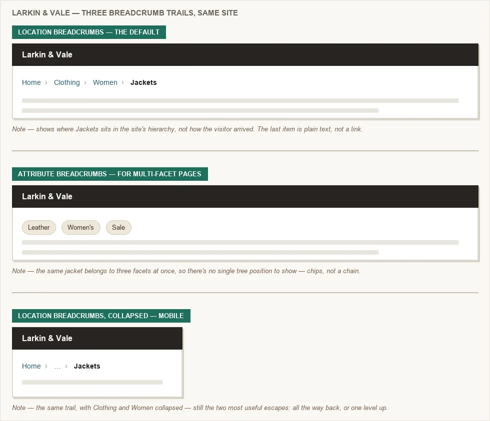 The same jacket, three ways of showing where it sits — a hierarchy, a set of facets, or the hierarchy with its middle folded away for a narrow screen.
Background
Interface Design Principles (principle 5: user control and freedom) describes breadcrumbs as an “exit” mechanism: they let users undo a navigation mistake without pressing the browser back button repeatedly — the same structured markup can also surface as a path trail in a search result itself, replacing the raw URL (see Search Engine Optimization).
Problem
On a site with three or more levels of hierarchy, a user who arrives mid-hierarchy (from a search engine or direct link) or navigates several levels deep has no way to tell where they are in the site’s structure. They also have no way to get back to an ancestor level without leaving the page to check.
On a site with three or more levels of hierarchy, a user who arrives mid-hierarchy (from a search engine or direct link) or navigates several levels deep has no way to tell where they are in the site’s structure.
Solution
A breadcrumb trail is a horizontal navigation element that shows a user’s current position within a site’s hierarchy, typically as a sequence of clickable links leading from the homepage to the current page. The name comes from the Hansel and Gretel fairy tale, where characters left a trail of bread crumbs to mark their path back.
Breadcrumbs answer the question “where am I?” without requiring users to navigate away from the page, and provide a one-click shortcut to any ancestor level in the hierarchy. They are a secondary navigation aid — not a replacement for primary navigation — and are most useful on sites with three or more levels of depth.
Every site’s navigation has to answer three questions for a visitor: where am I now, where did I come from, and where can I go from here? A breadcrumb trail answers the first two directly — its final item shows current position, and each ancestor link shows the path back to the homepage — while the third is left to the page’s ordinary navigation and links. This split is why breadcrumbs are useful even on sites with strong primary navigation: they cover ground the rest of the page’s navigation doesn’t, rather than duplicating it. When a site has no better alternative for the third question, a site map serves as the fallback of last resort.
Every site’s navigation has to answer three questions for a visitor: where am I now, where did I come from, and where can I go from here?
Choose a breadcrumb type for the content’s structure
- Location breadcrumbs — the default for most sites. Also called hierarchical, these are the most common on the web. They reflect the site’s Information Architecture rather than the user’s browsing path — showing where the current page sits in the hierarchy regardless of how the user arrived. Example:
Home > Clothing > Women > Jackets. - Attribute breadcrumbs — for pages that belong to multiple facets. Reflect the current page’s category memberships rather than its position in a tree. Example:
Leather / Women's / Sale. Common in e-commerce and content libraries where items belong to multiple facets simultaneously. Often rendered as chips or tags rather than a linear chain. - Path breadcrumbs — avoid. These record the sequence of pages the user actually visited — equivalent to the browser’s back-history rendered as a visible trail. Rare in practice; they grow arbitrarily long, depend on arrival path rather than site structure, and create inconsistent trails for the same page.
Place and style breadcrumbs consistently
Standard placement: a single horizontal row, positioned below the site header/masthead and above the main content, so it’s readable without scrolling and clearly separated from both the navigation and the content body.
Standard visual separator: > or › between levels. / is used by some platforms (GitHub, Google Docs). Graphical arrows and chevrons are common alternatives. The separator should be visually lighter than the link labels so it reads as punctuation, not content.
The current page is typically the last item in the trail and rendered as plain text (not a link), since linking to the current page serves no purpose and creates a redundant click target. The trail itself starts at the homepage and ends at the parent section — the current page is omitted from the link chain, not appended to the end of it.
The current page is typically the last item in the trail and rendered as plain text (not a link), since linking to the current page serves no purpose and creates a redundant click target.
Use breadcrumbs when the hierarchy is deep and stable
Breadcrumbs add clearest value when:
- The site has three or more levels of hierarchy
- Users are likely to arrive mid-hierarchy (from search engines or direct links) rather than always entering from the homepage
- The hierarchy is stable and content belongs to one clear category path
Breadcrumbs work poorly when content belongs to multiple categories simultaneously — showing one arbitrary path through the taxonomy misrepresents the page’s position. In those cases, attribute tags (faceted navigation) are a better fit, and breadcrumbs can be omitted or supplemented.
Collapse the trail’s middle on narrow screens
On mobile viewports where horizontal space is limited, a common pattern is to collapse the middle of the trail and show only the first item (home) and the last linked item (parent), removing intermediate levels. This gives the user the two most useful escape routes — all the way back to the top, or one level up — without wrapping a long trail across multiple lines.
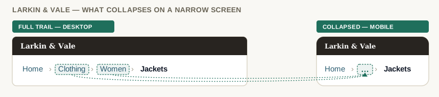 Clothing and Women collapse into the ellipsis — home and the current page, the trail’s two most useful escapes, stay put.
Skip breadcrumbs on flat sites and in linear flows
Breadcrumbs are most often misapplied in two contexts:
- Flat-structure sites: when all pages are at the same level with no hierarchy below the homepage, a breadcrumb adds no information. Users already know they’re one level deep.
- Linear transactional flows (checkout, application forms, registration): breadcrumbs imply free movement through a hierarchy. In a linear flow where the user must complete steps in order, breadcrumbs give a false impression of navigability and can disrupt the intended sequence. Use a step indicator instead, which shows progress without implying free navigation.
Make breadcrumbs accessible
The ARIA (Accessible Rich Internet Applications) authoring practices specify wrapping a breadcrumb in a <nav> element with aria-label="Breadcrumb" and marking the last item (current page) with aria-current="page". This lets screen reader users identify the element as navigation and understand which level they are currently on.
<nav aria-label="Breadcrumb">
  <ol>
    <li><a href="/">Home</a></li>
    <li><a href="/clothing">Clothing</a></li>
    <li aria-current="page">Jackets</li>
  </ol>
</nav>
The <ol> (ordered list) is deliberate, not <ul> — a breadcrumb trail’s items have a meaningful sequence, unlike an unordered list’s items. The current page is plain text within its <li>, not a link, per the no-self-link rule above.
Related Concepts
Patterns
- Multiple Ways to Navigate
- Navigation Menus
- Content Organization Schemes
- Category Pages
- Filters and Facets
- Consistent Sidebars of Related Content
- Search Engine Optimization
- Site Header
- Site Map (Navigation Page)
Principles
Further reading
Nielsen Norman Group’s “Breadcrumbs: 11 Design Guidelines for Desktop and Mobile” (commercially published, no stated open license) adds two rules beyond the placement and no-self-link guidance above: keep mobile breadcrumb links to a tap target of at least roughly 1cm × 1cm, and include only levels that have a real page behind them rather than logical grouping tiers a customer can’t actually navigate to.
Sources
Breadcrumb navigation (Wikipedia) is the source for the location/attribute/path type taxonomy, the Hansel and Gretel naming origin, and the standard below-the-masthead placement convention.
GOV.UK Design System supplies the Skip breadcrumbs on flat sites and in linear flows guidance and the mobile collapse-to-first-and-last-item pattern.
The Design of Sites: Pattern Group K — Making Navigation Easy is the K6 Location Bread Crumbs pattern this page is built from — specifically the “where am I, where did I come from, where can I go” three-question framing in the Solution section.