
Loading States
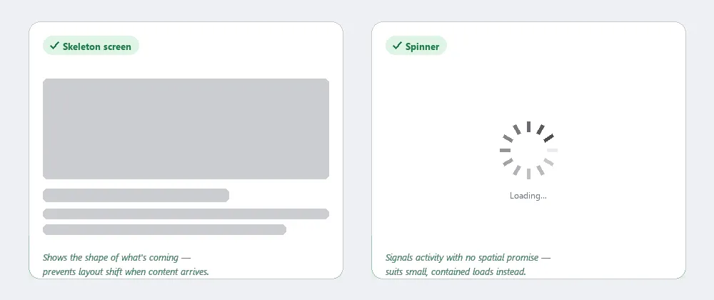 Skeleton screens preview the shape of what’s coming; spinners just prove the system is still working.
Problem
Every delay between a user action and a system response is an opportunity to lose trust or cause confusion.
Every delay between a user action and a system response is an opportunity to lose trust or cause confusion.
Solution
Loading states bridge that gap: they signal that something is happening, set expectations about what is coming, and minimize disruption when content arrives. A loading state is a mitigation, not a fix — before reaching for one, consider whether the underlying operation’s speed or responsiveness can be improved so the wait doesn’t need bridging in the first place.
A loading state signals that the system is working on one operation; a Progress Bar signals a customer’s position within a multistep task they’re actively driving (a checkout, a form wizard). The two are complementary rather than interchangeable — a long single operation with distinct named phases can combine both, but a “progress bar” with no customer-driven steps behind it is really just a loading state. A loading state is also distinct from an empty state: a loading state promises content is still coming, while an empty state has already concluded there’s nothing to show right now.
Choose between a skeleton screen and a spinner
Use skeleton screens for large content blocks where layout shift would be disruptive. Skeleton screens show the layout structure that will be occupied by incoming content, rendered as neutral placeholder blocks. They communicate not just “loading” but “content of approximately this shape is coming,” and they prevent layout shift — the disorienting reflow that occurs when a page reorganizes itself around content that arrives after the initial render. Skeletons are appropriate for large content blocks where layout shift would be most disruptive.
They communicate not just “loading” but “content of approximately this shape is coming,” and they prevent layout shift — the disorienting reflow that occurs when a page reorganizes itself around content that arrives after the initial render.
Use spinners for small, contained loads with nothing to preview. Spinners signal activity without making any spatial promise about what’s coming. They suit smaller, contained loads — confirming a button action, an inline data refresh — where there’s no layout to preview. A static text message is simpler still but can become indistinguishable from a stalled page; an animated indicator at least proves the browser is still responsive. See Interface Design Principles (principle 2) for the general tradeoff between what a loader can credibly promise and what it commits to. A “thinking” or “typing” indicator in an AI chat interface is this same spinner pattern, applied to a reply that’s still being generated.
Show loading states on buttons
When a button triggers an action that takes time to complete, the button can switch to a loading indicator to prevent double-submission and confirm the action was received. Keeping the button’s dimensions stable during the loading state — so the surrounding layout doesn’t shift — is part of the same layout-stability goal that makes skeleton screens valuable for larger content.
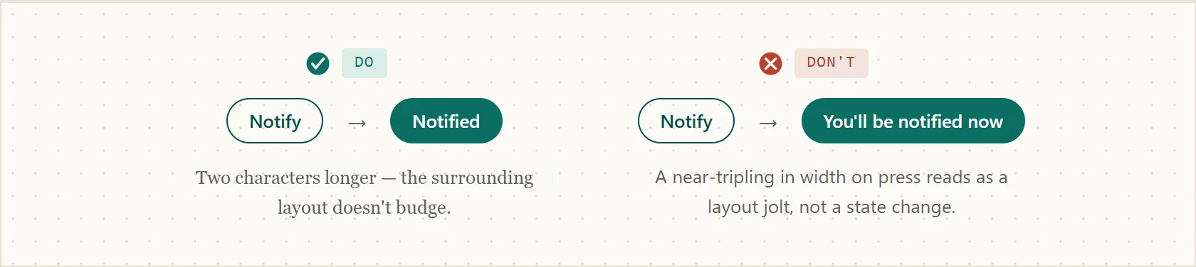 A button’s own label can cause the same layout jolt a slow network request does — match the label length, not just add a spinner, to keep the surrounding layout still.
Time loaders for long operations
Not every action needs a loader: for very fast responses, showing one at all can create a brief visual flash that reads as a glitch. For genuinely long operations, a loader that never updates its state eventually reads as frozen, regardless of what it actually shows. Updating a loader’s message or appearance during a long wait reassures users that the system is still working — a change too slow or too subtle to register is Change Blindness by another name, and content that finishes loading somewhere outside the area a person is actually looking has the same problem regardless of how fast it arrived.
A loader still has to have an end state: never let it loop indefinitely with no way out. If something goes wrong or the wait times out, replace it with a clear error and a link to another suitable action, rather than leaving the loader spinning over a failure it can’t recover from.
Not every action needs a loader: for very fast responses, showing one at all can create a brief visual flash that reads as a glitch.
Mark the loading region for assistive technology
A loading indicator that’s purely visual — an animated icon with no corresponding markup change — is invisible to a screen reader user until the surrounding content itself changes. Applying role="status" to the element containing the loading message turns it into a live region that assistive technology monitors for updates, and updating that region’s text as the state changes (e.g. from “Loading…” to the arrived content, or to an error) announces the change automatically instead of requiring the user to go looking for it.
<div role="status">Loading…</div>This matters because an animated indicator’s own reassurance value is otherwise sighted-only: user research cited by the Home Office Design System found that an animated spinner gave users more confidence something was still happening than a static text message alone — a difference that only reaches assistive-technology users if the state change is exposed to them the same way.
Related Concepts
Patterns
Principles
Further reading
Victor Ponamariov’s 50 Tips to Improve User Interface (goodreads.com/book/show/58085971-50-tips-to-improve-user-interface — self-published ebook, no stated license) covers many loading-state specifics beyond this page’s own guidance. One example: a button-loading technique that keeps the button’s width stable by making its text transparent rather than removing it entirely.
Bruce Tognazzini’s First Principles of Interaction Design (asktog.com — no stated open license) gives a specific delay-to-indicator table: acknowledge any click within 50 milliseconds, use a busy cursor for waits under 2 seconds, state the expected wait once it passes 2 seconds, switch to a full progress indicator past 5 seconds, and add a sound plus strong visual cue once a wait passes 15 seconds.
Sources
Loading Spinner (Home Office Design System) (Open Government Licence v3.0) is the source for the “improve the wait before bridging it” framing above, the timeout/failure handling guidance, the role="status" accessibility technique, and the animated-vs-static confidence finding.