
Change Blindness
Overview
Change blindness is the failure to notice a visual change happening right in front of you, because attention is selective rather than exhaustive: the brain processes what it currently judges important and can miss something else that seems obvious in retrospect. The effect was demonstrated by psychologists Christopher Chabris and Daniel Simons in a famous 1999 experiment: participants asked to count how many times players wearing white passed a basketball — a task that occupies attention — largely failed to notice a person in a gorilla suit walking directly through the middle of the scene. About half of participants missed it entirely.
Change blindness is the failure to notice a visual change happening right in front of you, because attention is selective rather than exhaustive: the brain processes what it currently judges important and can miss something else that seems obvious in retrospect.
Why it happens on interfaces
The same selective attention that misses a costumed gorilla mid-experiment misses an interface change that isn’t visually distinct enough from what surrounded it a moment before. A page that looks almost the same after an action — a small text line appearing, a value updating quietly, a status changing color slightly — gives a person no strong reason to notice that anything happened at all, and they’re left re-checking whether their action even registered. This is the same territory the gulf of evaluation covers from a different angle: a state that’s technically communicated but not perceptible widens that gulf exactly as much as a state that was never communicated in the first place.
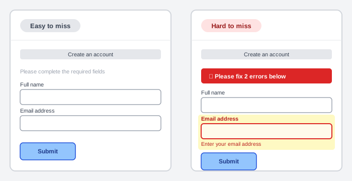 Both forms are otherwise identical — only the error’s own visual salience differs.
A page that looks almost the same after an action — a small text line appearing, a value updating quietly, a status changing color slightly — gives a person no strong reason to notice that anything happened at all, and they’re left re-checking whether their action even registered.
Design implications
- Make the change itself obvious — a color or layout shift that stands out from the surrounding page, or motion (a fade, slide, or pulse) to catch the eye — rather than relying on a person to notice a small addition to an otherwise-unchanged screen. Stacking several distinct cues (an icon, a colored banner, a highlighted field background, a colored border) compounds rather than substitutes: each one gives an independent chance of being noticed, which matters most for someone who can’t perceive one of the channels at all.
- Direct attention when a change needs it — auto-scrolling to a newly-relevant section, or a temporary highlight, for a change a person would otherwise be likely to miss entirely.
- Keep feedback local to what changed — a message positioned next to the specific field or element it concerns is far more likely to be seen than an equivalent message placed generically elsewhere on the page (the same discipline placing validation errors near the field already argues for).
- Minimize changes that aren’t necessary — every element that moves or appears costs a person’s attention to process, whether or not they consciously register it.
- Provide clear feedback after every action — a successful submission, an item added to a cart, a filter applied — so a person never has to search the page to confirm whether their action actually registered.
- Be judicious rather than exhaustive — not every update deserves a high-salience treatment; reserve it for moments where a person could otherwise be left unsure whether something happened.
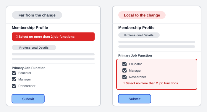 The message is identical in both panels — only its distance from the checkboxes it refers to determines whether a person connects the two.
Minimize changes that aren’t necessary — every element that moves or appears costs a person’s attention to process, whether or not they consciously register it.
Recognizing it in already-documented patterns
This same failure mode recurs across several already-documented patterns, once named: Error Messages‘s account of USWDS’s deprecated live-validation checklist — where testing found screen-reader and screen-magnification users often didn’t notice the requirement list updating in real time — is a change-blindness failure by another name. A confirmation toast positioned far from where a person just clicked risks the same fate, as does an add-to-cart action with no clear confirmation, or a loading indicator or async content that updates too slowly, too subtly, or somewhere outside the area a person is actually looking. Change blindness is also a direct tax on working memory: every time a person has to actively search a page to confirm whether something changed, that search itself is effort the interface should have spared them.
Related Concepts
Patterns
Principles
Further reading
Simons and Chabris’s “Gorillas in Our Midst: Sustained Inattentional Blindness for Dynamic Events” (Perception, 28(9), 1059–1074, 1999 — commercially published, no stated open license) is the original study behind the invisible-gorilla experiment this page’s name comes from: roughly half of viewers counting basketball passes in the video failed to notice a person in a gorilla suit walk through the scene for nine seconds, and the paper situates that finding within the broader inattentional-blindness literature on dynamic, not just static, scenes.
Sources
The Vanishing Act: How Change Blindness Affects Your Users (and What to Do About It) is this page’s sole source — the Chabris/Simons gorilla experiment, the list of where the failure recurs on the web, and the six design techniques above. The source’s own Dell and ACM screenshot examples aren’t named here directly (real third-party UI, not embeddable per Image Policy); the illustrations above generalize the same contrasts those examples make — low salience vs. high salience, and feedback placed far from vs. local to the control that triggered it (the ACM job-function-limit error, specifically).