
Account Management
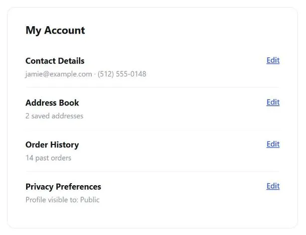 One hub where a customer can audit everything the site knows about them in a single visit, rather than hunting across scattered settings screens.
Problem
Any site that personalizes anything — recommendations, saved addresses, favorite discussion boards, subscription preferences — has to store customer data somewhere, and customers need a way to see, correct, and delete that data themselves. This is more than fairness: it’s one of the fair information practices (the access principle), and depending on jurisdiction and industry it’s also a hard legal deadline rather than just good practice — HIPAA gives patients 30 days to fulfill a records request, CCPA/CPRA gives California residents 45 (extendable once), and GDPR grants a comparable access right EU-wide. It’s practical necessity too, since a customer who moves needs to be able to update a stored address.
Any site that personalizes anything — recommendations, saved addresses, favorite discussion boards, subscription preferences — has to store customer data somewhere, and customers need a way to see, correct, and delete that data themselves.
Solution
Provide one consolidated page for auditing account data, and also surface the same data in task-based context for editing — the two approaches below, used together.
Provide one consolidated page
Provide one consolidated page that holds all of a customer’s account information in a single place — contact details, address book, order history, saved preferences, privacy preferences. A single hub makes it possible for a customer to audit everything the site knows about them in one visit, rather than hunting across scattered settings screens.
Also expose the same data in task-based context
A centralized page is good for auditing, but bad for editing in the moment — a customer checking out shouldn’t have to abandon the flow, navigate to account settings, change a credit card, and navigate back. Surface the relevant fields for a specific task (changing payment method during checkout, adding a shipping address while placing an order) directly within that task. This is the same organize-by-task-vs-organize-centrally tension described generally in Content Organization Schemes; account management is the case where a site typically needs both schemes at once, not one or the other.
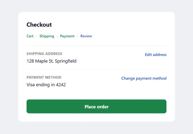 Changing a payment method or shipping address happens right where the customer already is, not through a detour to a separate account page.
A centralized page is good for auditing, but bad for editing in the moment — a customer checking out shouldn’t have to abandon the flow, navigate to account settings, change a credit card, and navigate back.
Make the management page easy to find
Put the account link in the primary navigation, conventionally near the top right of the page — that position is where customers have been shown to expect it, and following the convention outweighs the (small) benefit of a novel placement. Common labels: “My Account,” “Update Profile,” “My [Brand].” Whatever the label, the link to modify privacy preferences specifically should always be reachable from this page.
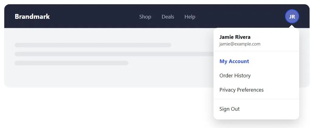 Putting the menu in the same top-right spot customers already expect, rather than a novel placement, is what makes it findable.
Put the account link in the primary navigation, conventionally near the top right of the page — that position is where customers have been shown to expect it, and following the convention outweighs the (small) benefit of a novel placement.
Scale protection to data sensitivity
The more sensitive the stored data (financial information especially), the stronger the connection and access control needs to be — see Trust and Credibility for secure-connection signaling.
Relate to other patterns
Account management is the natural home for everything a customer might otherwise have scattered across a site: favorite discussion boards, subscription settings, saved addresses, saved payment methods, and order history. It depends on persistent customer sessions to recognize a returning customer at all, and its account-creation counterpart is Sign-In and Account Creation.
Related Concepts
Patterns
- Sign-In and Account Creation
- Privacy Preferences
- Content Organization Schemes
- Order Tracking and History
- Personalized Recommendations
- Email Communications
Principles
Standards
- Fair Information Practices
- HIPAA (Health Insurance Portability and Accountability Act)
- CCPA / CPRA (California Consumer Privacy Act / California Privacy Rights Act)
- GDPR (General Data Protection Regulation)
Sources
The Design of Sites: Pattern Group H — Helping Customers Complete Tasks is this page’s sole source — the H4 Account Management pattern’s two-part solution (one consolidated audit page, plus task-based contextual access to the same data) is what this page documents directly.