
Page Template
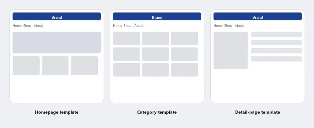 Three individual templates derived from one global template: branding and the nav row stay fixed across all three, while the content area is organized differently for each page class — a hero and grid on the homepage, a uniform product grid on the category page, and a lead image with a sidebar of details on the detail page.
Background
The six layout patterns documented in Pattern Group I of The Design of Sites (Grid Layout, Above the Fold, Clear First Reads, expanding and fixed screen width, and Consistent Sidebars of Related Content) are each described in the source as contributions to the page template — each governs one dimension of the template’s structure. Responsive Web Design adds a viewport dimension to the template: the same structural template reflows at defined breakpoints for different viewport sizes, so a single template definition covers the full range of screen widths rather than requiring separate mobile and desktop versions.
Problem
Designing each page’s layout independently leaves customers unable to predict where navigation, content, and other regions will appear from one page to the next, forcing them to reorient on every visit instead of building on what they’ve already learned about the site.
Designing each page’s layout independently leaves customers unable to predict where navigation, content, and other regions will appear from one page to the next, forcing them to reorient on every visit instead of building on what they’ve already learned about the site.
Solution
A page template is a reusable structural layout applied consistently to all pages of the same type on a site. Where a grid defines the underlying column-and-row system, a page template fills that grid with fixed-position regions — header, navigation, main content area, sidebar, footer — whose positions stay stable across every page in the same class. A customer who has seen one product page on a site has implicitly learned the template; the second product page requires no reorientation.
Use templates to make consistency structural
Consistency is one of the seven principles in Interface Design Principles: when the same element appears in the same place every time, customers build expectations that let them navigate faster on repeat visits. Page templates operationalize consistency at the structural level — they make it impossible (or at least inconvenient) for individual pages to drift away from the site’s established layout.
Page templates operationalize consistency at the structural level — they make it impossible (or at least inconvenient) for individual pages to drift away from the site’s established layout.
Templates also separate concerns: the template determines where things appear; content determines what appears. A well-designed template can absorb a wide range of content without breaking — short or long articles, dense or sparse product pages, narrow or wide images — because the structural regions are built to flex while maintaining their relative positions.
Choose your template classes
A site typically has a small set of distinct templates corresponding to its page types, not a single universal template for all pages:
- Homepage — highest-stakes first impression; often the most bespoke layout, though still built on the site grid
- Category / section pages — consistent navigation entry points into a product or content area; see Category Pages
- Detail pages — the canonical leaf page type: an article, a product, a profile; often the most standardized template on the site since the content structure is predictable (see Clean Product Details for the e-commerce variant)
- Search results — a distinct template optimized for scanning a list rather than reading a single item
- Checkout / form pages — often stripped-down templates that suppress non-essential navigation to focus the user on a single task (see Quick-Flow Checkout)
Build templates into the development process
Per Web Site Development Process, page templates emerge during the Refinement phase — the site is broken into template classes (homepage, second-level, leaf page) rather than designing every page individually. In the Production phase, each template class is refined into an interactive prototype and eventually into a reusable HTML skeleton that forms the technical basis for implementation. Defining templates early reduces both design and development effort: decisions made once in the template propagate to every page in that class.
Combine global and individual templates
The Design of Sites’ own PAGE TEMPLATES pattern (Pattern Group D) distinguishes two levels of templating that work together:
- Global page template — describes the overall structure shared by every page on the site: navigation elements at the top (branding, a navigation bar, a search action module), and supplementary links at the bottom (an About Us page, a privacy policy, FAQs, Context-Sensitive Help).
- Individual page templates — build on the global template to describe a specific page class (e.g. Category Pages, product detail pages, news articles), each with its own content-size limits for images and text.
<body>
  <a href="#main" class="skip-link">Skip to main content</a>
  <header>
    <a href="/">Brand</a>
    <nav aria-label="Main">…</nav>
    <form role="search">…</form>
  </header>
  <main id="main">
    <!-- each individual template defines what goes here -->
  </main>
  <footer>
    <a href="/about">About us</a>
    <a href="/privacy">Privacy policy</a>
    <a href="/faq">FAQs</a>
    <a href="/help">Help</a>
  </footer>
</body>
Each fixed region of the global template gets its own landmark element, so its structure is available to screen readers as well as visible on screen, and the skip link lets keyboard users pass the repeated header on every page (see Accessibility). Individual templates then mostly change what goes inside <main>.
Use a grid as the template’s backbone
Use a grid as the backbone of every template — people read along the implied vertical and horizontal lines a grid creates, so aligning content to it lets customers skim and read faster. Within that grid, set aside dedicated areas for navigation, content, and Consistent Sidebars of Related Content, with rules governing what may appear in each area — this becomes especially important once multiple teams are updating different parts of a site independently. Content modules are the live content that fills a template’s content areas; the template is the skeleton, the content modules are what bring it to life. Templates should also settle, up front, what must appear above the fold and whether the layout uses expanding or fixed screen width.
Design for small multiples of difference
Related templates should be built as variations on a shared base rather than as independent designs, so that a family of pages reads as one system even when specific elements (a section’s navigation bar highlighting, which images repeat) differ slightly from page to page. Banana Republic’s product-line pages are the source’s example: color, layout, and navigation structure stay identical across sections, with only the active navigation state and imagery changing to address each section’s specific need.
Related templates should be built as variations on a shared base rather than as independent designs, so that a family of pages reads as one system even when specific elements (a section’s navigation bar highlighting, which images repeat) differ slightly from page to page.
A dedicated printable version of a template — created by stripping non-essential regions rather than redesigning from scratch — lets customers view and print long content as a single, simplified page.
Related Concepts
Patterns
- Grid Layout
- Above the Fold
- Clear First Reads
- Expanding and Fixed Screen Width
- Consistent Sidebars of Related Content
- Multiple Ways to Navigate
- Category Pages
- Clean Product Details
- Responsive Web Design
- Quick-Flow Checkout
- Content Modules
- Printable Pages
- Personalized Content
- About Us Pages
- Privacy Policy
- Frequently Asked Questions
- Context-Sensitive Help
Principles
Processes
Sources
The Design of Sites: Pattern Group I — Designing Effective Page Layouts is the source for Background’s framing of the six Pattern Group I layouts as each contributing one dimension to the template’s overall structure.
The Design of Sites: Ch. 5 — Processes for Developing Customer-Centered Sites is the source for “Build templates into the development process” — how template classes emerge during the Refinement phase and get carried into an interactive prototype, then a reusable HTML skeleton, during Production.
The Design of Sites: Pattern Group D — Writing and Managing Content is the source for Pattern D1 itself: the global-vs-individual template distinction, using a grid as the template’s backbone, and the Banana Republic example of related templates varying only navigation state and imagery rather than being redesigned independently.