
Accessibility
Designing so that variation in customers’ perceptual and physical abilities doesn’t lock anyone out — part of understanding people in general, alongside the broader human-abilities discussion in Know Your Customers.
Business case: the Web Accessibility Initiative cites a statistic that 71% of website visitors with disabilities will simply leave a site that isn’t accessible — the same abandon-on-friction dynamic customer-centered design generally argues for, just measured for this specific population. Accessibility work also tends to help more people than its target audience alone — the curb-cut effect: a curb cut meant for wheelchair users also helps people on roller blades or pushing strollers, the same way captions meant for deaf viewers also help anyone watching in a loud room or a quiet one late at night. Designing for accessibility is rarely a cost paid for a narrow group; it’s usually a usability improvement that happens to be necessary for some customers and merely convenient for everyone else.
Designing for accessibility is rarely a cost paid for a narrow group; it’s usually a usability improvement that happens to be necessary for some customers and merely convenient for everyone else.
Design targets and controls for motor and keyboard access
Accessibility isn’t only about perception — motor control matters too. Organized Search Results notes that making clickable targets (like a “Next” pagination link) large rather than a small word or icon helps customers with limited fine motor control click accurately, with the side benefit of also being easier to hit on mobile/touch devices — the same target-size effect Fitts's Law quantifies in general.
Keyboard accessibility requires several concrete provisions beyond simply making elements reachable by Tab:
- Keep the focus indicator visible. The currently-focused element must show a visible focus indicator — typically the browser’s default outline — because suppressing it with CSS (
outline: none) removes the only visual cue that sighted keyboard users have of where they are on the page. - Give the tab order a predictable, page-wide convention. A common, sensible default sequences focus by page region rather than leaving it to arbitrary source order: header first, then the main navigation, then in-page or content navigation (left to right, top to bottom), and the footer last. Every customer navigating by keyboard should get the same intentional experience a mouse user gets by glancing at the layout, rather than a tab order that only happens to match the visual layout by accident.
- Add a skip-to-content link. A visually hidden link that becomes visible on focus, placed as the first item in the tab order, and jumping past repeated header navigation to the main content area, lets keyboard users bypass the nav bar without tabbing through every element on every page load.
- Trap focus inside modals. Where Modal Dialogs are used, focus must enter the modal on open, be trapped inside it (Tab and Shift-Tab cycling within the dialog only), and return to the triggering element when the dialog closes — see WAI-ARIA for the required ARIA (Accessible Rich Internet Applications) attributes.
- Associate form labels correctly. Form inputs need correctly associated
<label>elements rather than placeholders alone — placeholders disappear when a user starts typing and are not reliably announced by all screen readers (see Form Design).
Prefer real redirects over automatic page refreshes
Prefer a real HTTP redirect (a server-side 301, or a plain link the customer clicks themselves) over an automatic reload. An automatically reloading or redirecting page (<meta http-equiv="refresh">) is a narrower but concrete instance of the same “don’t take control away from the customer” problem: in some browsers it breaks the back button, and some screen readers never announce that the page changed at all, silently dropping a user who was mid-read or mid-interaction into different content with no cue anything happened. Where a timed refresh is genuinely unavoidable, give it a generous delay and pair it with a visible link to the destination as a fallback for anyone the automatic behavior fails.
Support assistive technology beyond screen readers
Full accessibility means the site has to work for people relying on assistive technology entirely:
- Make every interactive element reachable and operable via keyboard alone, not just mouse or touch, and meaningful to a screen reader — which depends on properly labeled headings, every image carrying the right kind of description (see Alt Text), and link text whose purpose is clear out of context rather than a bare “click here.”
- Prefer native HTML semantics over ARIA, and use ARIA to fill the gap custom widgets create. Custom, JavaScript-driven widgets (tabs, dropdowns, live-updating regions) need extra help here, since plain HTML has no vocabulary to describe what they are or how their state just changed — see WAI-ARIA (Accessible Rich Internet Applications) for how that gap gets filled, and why preferring native HTML semantics over it is itself the standard’s own first rule.
- Give icon-only buttons an accessible name. Icon-only buttons (hamburger menus, search buttons, close buttons) with no visible text label must carry an accessible name via
aria-labelso screen readers can announce their function. - Announce dynamic content updates via ARIA live regions. Search suggestions, live status changes, and inline validation results must be announced (
aria-live="polite"for non-urgent,aria-live="assertive"for urgent) so screen reader users learn of changes that occurred outside their current focus. - Remember assistive technology beyond screen readers, too: refreshable braille displays, screen magnification software, speech-recognition input, keyboard overlays, and closed captioning or sign-language access for video and audio content all fall under the same umbrella.
- Test for real conformance, not just automated scans. The formal standard this is measured against is the W3C’s WCAG, alongside the U.S.’s Revised Section 508 — accessibility compliance is now a near-universal legal requirement well beyond the U.S., though see Web Content Accessibility Guidelines (WCAG) for the specific standard versions and conformance levels different jurisdictions actually mandate, which vary enough that no single law or version number is authoritative everywhere. Conformance needs both automated checks and direct testing with people who actually use assistive technology, since a tool that only scans for missing
altattributes catches a small fraction of real problems — a 2018 WebAIM survey found about 93% of respondents had never had formal accessibility training, which helps explain why automated-only checking remains so common despite its limits.
Sites serving a multilingual audience extend the same inclusivity goal to language itself, not just ability.
Combine multiple accessibility-testing methods
A 2005 study (Mankoff, Fait, and Tran) compared four ways of finding accessibility problems against a full lab study with blind participants: automated tools, expert review with a screen reader, expert review without one, and remote testing with blind users. Counterintuitively, the remote test with actual blind users performed poorly, while expert review using a screen reader found the most problems of the four — but still only about half of what the full lab study found. The takeaway generalizes beyond blindness specifically: no single accessibility-evaluation method catches most problems on its own, so combine methods rather than picking one and trusting it — the same “use all three together” logic Usability Evaluation Methods argues for evaluation generally.
The takeaway generalizes beyond blindness specifically: no single accessibility-evaluation method catches most problems on its own, so combine methods rather than picking one and trusting it — the same “use all three together” logic Usability Evaluation Methods argues for evaluation generally.
Separate content from presentation
Keep a page’s content separate from its visual presentation (e.g. via style sheets rather than mixing layout instructions directly into markup) — this serves accessibility specifically, beyond the ordinary maintainability case for separating content from presentation: a screen reader has less irrelevant markup to read past, and a customer who needs larger text or different colors can override the presentation layer without the underlying content breaking.
Structure the page with landmark regions
A page’s structural organization matters for accessibility beyond visual layout. Three elements assist users who navigate by structure rather than visual scan:
Nest headings hierarchically: headings (<h1>–<h6>) should nest logically — an <h3> should appear only inside an <h2> section. Screen reader users routinely navigate by jumping between headings, so a flat heading structure (all <h2>) or an illogical one (skipping from <h1> to <h4>) destroys this navigation mode. Headings are structure signals, not size controls — never choose a heading level to achieve a visual size.
DOM order must match reading order, not just visual order. CSS determines how a page looks; a screen reader follows the source order of the underlying HTML regardless of how CSS arranges it visually, so a layout that reads correctly to the eye can still read out of sequence to a screen reader. A concrete failure case: a four-step recipe laid out as a 2×2 grid (Step 1 top-left, Step 2 top-right, Step 3 bottom-left, Step 4 bottom-right). If the HTML is authored in that same visual order — Step 1, Step 2, Step 3, Step 4 in the markup — a screen reader announces the steps correctly. But if the HTML instead groups the steps by column (a left-column <div> containing Steps 1 and 3, a right-column <div> containing Steps 2 and 4) — a structure some sighted users might not even notice, since it still looks like a 2×2 grid — a screen reader will verbalize the steps out of order (1, 3, 2, 4) by default, scrambling a sequence where order is the entire point.
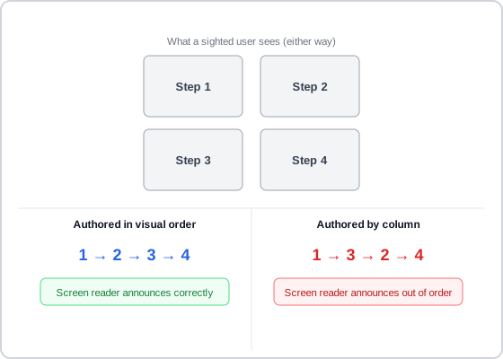 Both versions look identical on screen — the difference only surfaces once you can’t see the layout at all.
Add landmark regions: wrapping major page areas in semantic elements (<header>, <nav>, <main>, <footer>, <aside>) creates “landmark” regions that assistive technology can jump to directly. A user with a screen reader can skip straight to the main content without reading through the header and navigation — equivalent to the sighted experience of glancing at the page layout and reading only the relevant section. The same structure improves mobile reader mode and search engine indexing.
Add skip links: a visually hidden link placed first in the tab order — “Skip to main content” — lets keyboard users bypass the header and navigation on every page load and jump directly to the <main> element. It becomes visible on focus for sighted keyboard users. This is the most impactful single accessibility addition for keyboard-only navigation; Breadcrumb Navigation placement before the <main> element ensures skip links bypass breadcrumbs too.
Keep content in the page’s own flow, not sealed inside an embed: a browser’s built-in find-in-page (Ctrl-F) can’t search across an iframe boundary or inside an image, and keyboard paging (PageDown, spacebar) can stop working reliably once focus lands inside a separately-scrolling embedded frame instead of the page itself. Wrapping structural content — a schedule, a table, a whole document — in an embedded object for authoring convenience trades away these built-in browser behaviors, which users rely on without ever thinking to check for them until they’re gone.
Control motion for vestibular safety
Motion can disorient or physically harm some users, not just distract them — vestibular disorders and photosensitive epilepsy are the two specific risks this covers. Several concrete constraints, most mirrored in WCAG’s own success criteria:
- Make auto-moving content pausable, stoppable, or hideable once it’s run longer than five seconds. Content that moves, scrolls, or blinks automatically (carousels, auto-advancing banners, background animation) can’t be left running indefinitely, since a user can’t necessarily read or interact with something that keeps moving out from under them.
- Keep flashing content under three flashes per second, and avoid flashing large central regions of the screen. Content that flashes faster or more broadly than that threshold can trigger seizures in susceptible users, making this a hard safety limit rather than a soft usability preference. A transition to or from a saturated red carries its own seizure risk independent of flash rate or overall brightness — avoid it in any rapidly transitioning or flashing element regardless of how the surrounding content is lit.
- Limit repeating stripe patterns even when nothing is moving or flashing. Five or more light-dark stripe pairs — parallel, radial, curved, or straight — can trigger a photosensitive seizure through the same visual-cortex mechanism the flash-rate limit exists to interrupt, even in a completely static image; an unchanging pattern gets a looser threshold (eight pairs) since it’s inherently less provocative than one that animates.
- Honor a user’s system-level “reduce motion” preference as its own accommodation, not a substitute for the limits above. Where the browser or OS reports that a user has turned on a reduced-motion setting, minimize or remove non-essential animation for that user specifically — this is a proactive opt-out some users set once and expect respected everywhere, distinct from the five-second and flash-rate limits above, which protect every user regardless of whether they’ve set that preference. See Motion Design for the same requirement from the other direction — a state change communicated by motion must remain understandable with the motion itself removed.
A transition to or from a saturated red carries its own seizure risk independent of flash rate or overall brightness — avoid it in any rapidly transitioning or flashing element regardless of how the surrounding content is lit.
Sound needs the same “don’t let it run uncontrolled” treatment: autoplaying audio (background music, video with sound) that plays over a screen reader makes the screen reader’s own speech hard to follow, so autoplaying sound needs an easy, immediately available pause or stop control. Critical audio content should also have a visual alternative — captions or a transcript — for users who can’t rely on sound at all.
Design for specific disability types
The guidance above (and on Color Theory, Alt Text, and Cognitive Accessibility) is organized by design topic; it’s also worth checking a design directly against the specific groups of people it needs to serve, since each experiences an interface differently and needs a different accommodation:
- Blind users rely entirely on a screen reader or Braille output and cannot use a pointer or mouse at all — Alt Text and the keyboard-accessibility provisions above exist specifically for this group.
- Low-vision users (about 4% of the population) may use a screen magnifier, a high-contrast mode, or an enlarged browser font rather than a screen reader — maximizing readability and checking how a layout holds up when magnified matters as much here as the raw contrast ratio.
- Color-blind users (8% of men, 0.4% of women) can’t distinguish some color pairs at all — the population the “never rely on color alone” rule exists to protect. This is the gulf of evaluation in miniature: a state communicated through only one channel widens that gulf specifically for whoever can’t perceive that channel, so the fix is the same one — make the state perceivable through more than one.
- Deaf and hard-of-hearing users rely on captioning and other visual substitutes for audio; any meaningful audio in a video or animation needs a transcript or captions, not just a mute control.
- Users with physical or motor disabilities may rely on a keyboard, trackball, or voice recognition rather than a mouse, or may not be able to use a keyboard at all — this is the direct justification for the keyboard-accessibility requirements above, not an optional nicety for a small group.
- Users with cognitive disabilities — difficulties here can include memory, problem-solving, attention, or reading comprehension. Concretely, this means avoiding unnecessarily complex language and keeping needed information visible rather than requiring it to be held in memory — see Cognitive Accessibility for the fuller treatment, including timing, focus behavior, review-before-submit, and the numbers-specific case for numeracy and dyscalculia.
Every one of these accommodations also benefits people outside its named group — the same curb-cut effect named at the top of this page: captions help anyone in a loud or silent room, high contrast helps anyone using a phone outdoors, and keyboard support helps anyone whose mouse just broke.
An AI-powered feature doesn’t get a pass on any of this: a system whose outputs are balanced across demographic groups can still be inaccessible to people with disabilities — bias mitigation and accessibility are separate problems, see Human-AI Interaction.
Related Concepts
Patterns
Principles
- Fitts's Law
- Interface Design Principles
- Color Theory
- Gulfs of Execution and Evaluation
- Cognitive Accessibility
- Human-AI Interaction
- Motion Design
Processes
Standards
Further reading
The WAI’s Page Structure tutorial (w3.org/WAI/tutorials/page-structure/ — W3C Document License; permits copying but not derivative works) covers heading hierarchy, landmark regions, and skip links in more implementation depth than the section above.
The W3C WAI’s Legal & General case study (w3.org/WAI/business-case/archive/legal-and-general-case-study — same license) reports a 2005 accessibility rebuild that doubled online quote/purchase volume within three months, while cutting content-maintenance time from five days to half a day and raising natural search traffic 50%.
The W3C WAI’s Tesco case study (w3.org/WAI/business-case/archive/tesco-case-study — same license) reports an accessible grocery-site rebuild costing roughly £35,000 that generated an estimated £13 million in annual revenue, much of it from customers well beyond the site’s original target audience of visually impaired shoppers.
A W3C WAI community case study on This American Life’s broadcast transcripts (w3.org/community/wai-engage/wiki/NPR_Case_Study — same license) found that publishing a transcript alongside every episode raised unique visitors 4.18% and organic search traffic 6.68% over 27 months, benefiting deaf and hard-of-hearing listeners and search indexing at the same time.
Victor Ponamariov’s 50 Tips to Improve User Interface (goodreads.com/book/show/58085971-50-tips-to-improve-user-interface — self-published ebook, no stated license) offers several concrete accessibility tips, including verifying WCAG contrast ratios and using the Fitts’s Law framing for large click targets.
Siteimprove’s All in One Digital Accessibility E-Book (siteimprove.com — no stated open license) names specific vision conditions beyond generic “color blindness,” each affecting a website differently: macular degeneration and diabetic retinopathy both blur central vision, cataracts cloud it entirely, and deuteranopia/protanopia/tritanopia each mute a different one of red, green, or blue rather than removing color perception altogether.
Sources
Design Principles (U.S. Web Design System) supplies the “Revised Section 508” standard named alongside WCAG, and the point that sites serving a multilingual audience extend the same inclusivity goal to language itself, not just ability.
The Design of Sites: Ch. 3 — Knowing Your Customers: Principles and Techniques is the source for framing accessibility as part of the “people” element in the four-part people/tasks/technology/context model this page’s opening line borrows from Know Your Customers.
The Design of Sites: Pattern Group J — Making Site Search Fast and Relevant supplies the organized-search-results (J3) point about large pagination-link targets helping customers with limited fine motor control, cited under Design targets and controls for motor and keyboard access.
Web Accessibility (Wikipedia) is the source for the “near-universal legal requirement well beyond the U.S.” framing and the 2018 WebAIM survey statistic (93% of respondents had no formal accessibility training).
Web Accessibility Initiative (Wikipedia) is the source of the 71%-visitor-abandonment statistic cited in the Business Case paragraph.
The Design of Sites: Pattern Group B — Creating a Navigation Framework is the book’s B9 Site Accessibility pattern, which is this page’s primary pattern-book source.
Accessibility (Material Design) is the source for the DOM-order-vs-visual-order four-step recipe-grid example and the vestibular-safety motion thresholds (pausable past five seconds, under three flashes per second).
Carbon Design System: Accessibility, Content, Color, Motion, Spacing, and Icon Guidelines (IBM) supplies the disability-type breakdown with its specific percentages (4% low vision, 8% of men/0.4% of women color-blind) and the header/main-nav/in-page-nav/footer tab-order convention.
AI Risk Management Framework (AI RMF 1.0) is the source for the bias-mitigation-is-not-accessibility caution added under Design for specific disability types.
Web Accessibility: Understanding Colors and Luminance (MDN Web Docs) supplies the saturated-red seizure-risk point under Control motion for vestibular safety.
Accessibility and Spatial Patterns (MDN Web Docs) supplies the repeating-stripe-pattern seizure risk (five moving/eight static light-dark pairs) under Control motion for vestibular safety.
Personalization to Help Browse Safely (MDN Web Docs) supplies the “reduce motion” system-preference point under Control motion for vestibular safety.