
Interface Metaphor
An interface metaphor borrows a set of visuals, actions, and procedures from a domain customers already understand, so an unfamiliar digital system reads as instantly graspable. That’s the underlying idea behind Nielsen’s “match between system and the real world” heuristic (see Heuristic Evaluation) and the direct historical root of Affordance‘s own three-dimensional-button example on Action Buttons.
An interface metaphor borrows a set of visuals, actions, and procedures from a domain customers already understand, so an unfamiliar digital system reads as instantly graspable.
The desktop metaphor and its variants
The desktop metaphor — files, folders, a trash can, a pointer that “picks up” and “drops” objects — is the dominant convention across desktop operating systems, including Microsoft Windows and Apple’s Macintosh lineage, alongside narrower conventions like the tree view for hierarchical file structures and skeuomorphism (a virtual object visually resembling its physical counterpart, e.g. an early calculator app rendered as a photorealistic physical calculator).
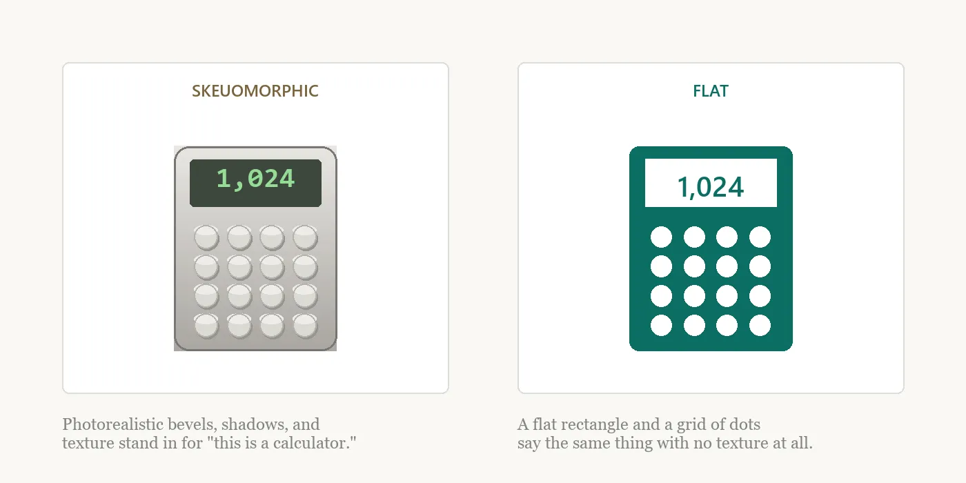 Skeuomorphism spells out what an object is; flat design assumes you already know.
The metaphor isn’t free of controversy
The convention is widespread, but the article notes a real gap: there’s a lack of empirical evidence actually supporting the claim that metaphors make an interface easier to learn or use, as opposed to simply being a widely-adopted convention. Expert users, in particular, often understand an interface well enough to bypass its metaphorical framing entirely, building their own shortcuts and mental models that owe nothing to the original physical analogy the metaphor was built on. A design shouldn’t lean on “it’s a familiar metaphor” as self-evident justification without checking whether the metaphor is actually carrying its own weight for the customers using it.
A design shouldn’t lean on “it’s a familiar metaphor” as self-evident justification without checking whether the metaphor is actually carrying its own weight for the customers using it.
Related Concepts
Patterns
Principles
Processes
Further reading
Bruce Tognazzini’s First Principles of Interaction Design (asktog.com — no stated open license) argues a metaphor should be abandoned once it stops helping: a satellite-dish-aiming app originally used a map metaphor that worked poorly in wooded areas with no visible landmarks, and was replaced with a live augmented-reality view of the sky that needed no map-reading skill at all.
Sources
Interface Metaphor (Wikipedia) (Wikipedia, CC BY-SA) is this page’s primary source — the desktop metaphor’s cross-platform ubiquity, the tree-view and skeuomorphism examples, and the critique that no empirical evidence actually supports metaphors improving learnability, which expert users often bypass in favor of their own shortcuts.