
Browsable Content
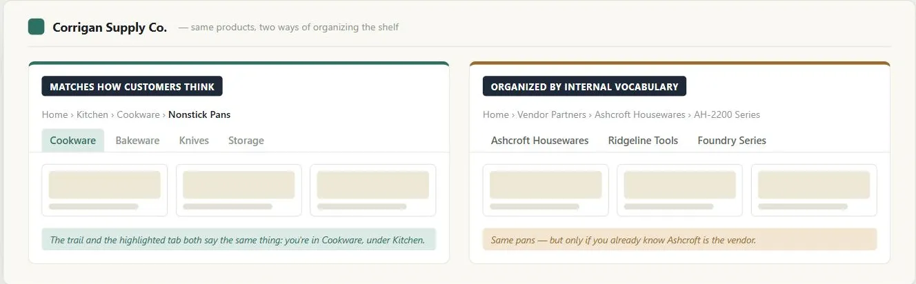 On the left, the breadcrumb and the highlighted tab both speak the customer’s language and show exactly where they are; organizing by vendor brand on the right breaks both at once — the trail reads like an internal org chart, and no tab lights up because none of them is what the customer searched for.
Background
One of the two intention-driven styles in Multiple Ways to Navigate (alongside search), for customers who don’t yet have a precise enough goal to search for, or who simply prefer following links. Libraries (organized for searching, via the Dewey decimal or Library of Congress system) and bookstores (organized for browsing, by genre/topic/author within loosely related sections) solve a related problem differently because their patrons have different needs — the same is true for content on the Web. Organizing for browsing and organizing for searching aren’t the same problem — a scheme that makes perfect sense to someone who already knows the destination (searching) can still leave a browsing customer lost if the category labels don’t signal what’s behind them clearly enough to follow on their own.
Problem
Browsing only works if content is organized in a way that matches how customers think about it, and if there are clear, consistent cues for where they are and how to get back — without both, browsing becomes either confusing or a dead end.
Browsing only works if content is organized in a way that matches how customers think about it, and if there are clear, consistent cues for where they are and how to get back — without both, browsing becomes either confusing or a dead end.
Solution
Pick an organizational scheme
Pick an organizational scheme that fits the content and the audience — see Content Organization Schemes for the five named schemes (hierarchical, task-based, alphabetical, chronological, popularity-based) and when each one fits, and Filters and Facets for narrowing further by attribute within whatever scheme is chosen, once a collection has enough independent attributes to support it.
Structure content with customers in mind, not your own internal vocabulary
Use Card Sorting to discover how customers naturally group items and what they call the groups, ideally with several people so disagreement can flag ambiguous terms.
Provide strong information scent
Information scent (a term coined by researchers at Xerox PARC) is the perceived proximity to the information a customer wants, built from cues like link/category text, images, headings, grouping, page layout, and what they’ve already seen. A label like “Movies” has good scent for someone looking for a DVD; a label like “Computers” has poor scent for someone looking for a digital music player, even though that’s arguably where it belongs. Redundant cues — listing the same item under more than one category — improve the odds a customer finds it regardless of which label they expect. The same principle extends beyond top-level categories to every navigational label and link text on the page: navigation bar items, dropdown menu entries, and inline link text should each predict their destination accurately. Link text like “click here” or “learn more” carries no scent — users following such links navigate blind, relying entirely on surrounding context to interpret where they’ll end up. The corollary: non-link text that resembles a link (underlined copy, blue-colored body text) creates false scent, misleading users who try to click it.
Information scent (a term coined by researchers at Xerox PARC) is the perceived proximity to the information a customer wants, built from cues like link/category text, images, headings, grouping, page layout, and what they’ve already seen.
Write descriptive, self-contained link text
A practical test for writing a link name: summarize the destination page in a few words using the journalist’s five Ws (who, what, when, where, why) rather than reusing a generic verb phrase. If the destination is already written with an inverted-pyramid lead (see Plain Language), its own title is usually already a good link name — the summarizing work has been done once, at the source.
Descriptive link names carry extra weight for screen reader users, who commonly skip past body text to scan a page’s list of links in isolation; a link that only makes sense in the surrounding sentence (“articles” instead of “three recent articles on e-commerce”) loses all of its context in that list, while a longer, self-contained name survives it. Longer link text also has a lower-tech benefit: it’s simply a bigger, easier target to click for anyone with limited motor precision.
Longer link text also has a lower-tech benefit: it’s simply a bigger, easier target to click for anyone with limited motor precision.
Help customers find their way back
Tab rows or breadcrumb trails let someone explore without fear of getting lost, and a clickable logo that always returns to the homepage is a near-universal expectation.
Avoid information overload
A clear Grid Layout, a strong Visual Hierarchy, consistent content/navigation areas, and a readable font let customers scan a page rather than having to read it end to end to find what they need.
This information scent requirement carries through wherever browsing leads: into Category Pages once a customer reaches a section, and onto the homepage itself, where it’s one of the things that makes navigation feel predictable.
Related Concepts
Patterns
- Multiple Ways to Navigate
- Content Organization Schemes
- Grid Layout
- Category Pages
- Homepage Portal
- Navigation Menus
- Filters and Facets
Principles
Processes
Further reading
Victor Ponamariov’s 50 Tips to Improve User Interface (goodreads.com/book/show/58085971-50-tips-to-improve-user-interface — self-published ebook, no stated license) contributes several navigation clarity tips relevant here, including frequency-first ordering for navigation menus.
Schade, Cheng, and Sherugar’s Top 10 Enduring Web-Design Mistakes (Nielsen Norman Group, 2016 — copyright NN/g, no open license; https://www.nngroup.com/articles/top-10-enduring/) names “islands of information” — related content left unlinked, pushing customers to a competitor or a search engine instead of deeper into the site — as one of several recurring navigation failures.
Sources
The Design of Sites: Pattern Group B — Creating a Navigation Framework is the B2 Browsable Content pattern this page is built directly from — the information-scent concept (coined at Xerox PARC) and the finding-your-way-back guidance.
The Design of Sites: Pattern Group K — Making Navigation Easy is the K9 Descriptive, Longer Link Names pattern behind Write descriptive, self-contained link text — the five-Ws test for summarizing a destination page in a link name.