
Stroop Effect
Overview
The Stroop effect is the measurable delay and increased error rate when a person is asked to name the ink color of a word that itself names a different color (naming the ink color of the word “red” printed in blue, for instance). An “emotional Stroop” variant, where emotionally-loaded words produce the same interference, shows the underlying mechanism isn’t about color specifically — it’s about what happens whenever two strong, automatic cues point in conflicting directions at once.
The Stroop effect is the measurable delay and increased error rate when a person is asked to name the ink color of a word that itself names a different color (naming the ink color of the word “red” printed in blue, for instance).
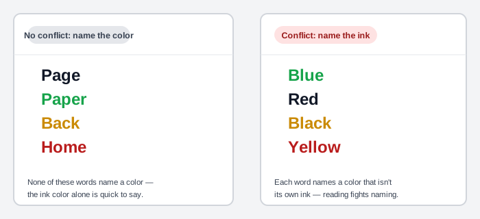 Try naming each word’s ink color, left to right — the right list is the one that trips people up.
Why conflicting cues interfere
The leading explanation, automaticity theory, holds that reading a word is practiced enough to happen automatically — and that automatic process consumes attentional resources a second, conflicting task then has to compete for, rather than simply yielding to it. In interface terms, the same competition happens whenever a design presents two or more strong cues in working memory that point to different answers: which button is the one to press, which number is the code and which is the price, which direction is “back.”
The leading explanation, automaticity theory, holds that reading a word is practiced enough to happen automatically — and that automatic process consumes attentional resources a second, conflicting task then has to compete for, rather than simply yielding to it.
Design implications
- A vending machine showing two numbers per item (an item code and a price, with no strong visual distinction between them) lets a customer accidentally key in the price and get the wrong product — the same interference as naming ink color while a word insists on a different one. A code that can’t be confused with anything else nearby — a letter-plus-number format, say, rather than another plain number — removes the conflict rather than asking the customer to resolve it correctly under pressure.
- A visually de-emphasized primary action — a dialog where Cancel is filled and prominent while Save, the actual next step, is left as a plain outline — sends two competing signals about which button matters; see establishing a button hierarchy for the fix.
- A control placed against platform convention — a back arrow at the top-right of a screen that otherwise reads left-to-right — forces a person to override a well-learned expectation just to find it, the same interference cost as an incongruent color word, paid every time the screen is used.
- Not every confusing interface is a true Stroop conflict: a row that’s clickable with nothing distinguishing it from the non-clickable rows around it isn’t two cues fighting each other — it’s a missing cue entirely, a hidden affordance rather than an interference effect. Both fail the same way from a customer’s perspective, but only one is fixed by removing a conflicting signal; the other needs a signal added.
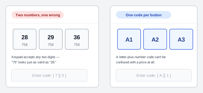 Same task, same layout — only the panel on the right removes the second number a customer could mistake for the code.
The general fix threading through all of these: align every cue — text, color, icon, position, animation, and behavior — so they communicate the same thing, which is the same discipline consistency (principle 1) already argues for from a different angle.
Related Concepts
Patterns
Principles
Further reading
J. Ridley Stroop’s original “Studies of Interference in Serial Verbal Reactions” (Journal of Experimental Psychology, 18(6), 643–662, 1935 — commercially published, no stated open license) is the paper the effect is named for: the color-word-naming-interference experiment itself, run as a series of timed reading-aloud tasks rather than the single quick demonstration the name now evokes.
Sources
Stroop Effect (Wikipedia) is the source for the effect’s definition, the automaticity-theory explanation, and the emotional-Stroop variant that first suggested the effect generalizes beyond color specifically.
When Your Design (Inadvertently) Fights Your Users is the source for the interface-design generalization and its worked examples — the vending-machine dual-cue case, the de-emphasized Save button, the misplaced back arrow, and the unlabeled-clickable-row distinction.