
Jump Menus
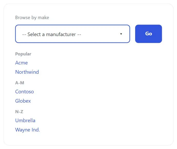 Grouped headings organize a link set too large for a standing navigation bar to hold.
Background
A jump menu trades permanent visibility for screen space. The links it holds are one interaction away instead of always on screen, which is the right trade once a link set is too large for a standing navigation bar, but the wrong one for the handful of destinations a customer needs constantly. Reserve jump menus for the long tail of navigation, not the primary paths through a site.
The links it holds are one interaction away instead of always on screen, which is the right trade once a link set is too large for a standing navigation bar, but the wrong one for the handful of destinations a customer needs constantly.
Problem
A large site can have more top-level destinations than any navigation bar can comfortably hold — none of the standard layouts scale gracefully to dozens or hundreds of links:
- A top-running bar runs out of horizontal space quickly.
- A side-running bar can grow long enough to push content below the fold and dominate the page.
- A combined top-and-left bar still consumes a lot of permanent screen space and may need a page reload to update.
Solution
A jump menu — a navigation control that expands to show a large set of links when triggered, and collapses back out of the way when not in use, so the full set of destinations exists without permanently occupying screen space.
A jump menu — a navigation control that expands to show a large set of links when triggered, and collapses back out of the way when not in use, so the full set of destinations exists without permanently occupying screen space.
Make the trigger obvious
Because a jump menu can appear anywhere on a page and serve any navigational purpose, its function has to be legible immediately: a heading or label beside the trigger naming what it links to (“Browse by Make,” “Go to Section,” “Account Services”), an instructional first entry inside the collapsed menu itself (e.g. “—Select—”, set apart with punctuation so it doesn’t read as an actual option and sorts first alphabetically), or a small arrow icon signaling that the control expands on interaction.
Organize the menu’s contents
Use whichever organization scheme fits the content: hierarchical grouping with category headings for menus mixing several kinds of links, task-based grouping for a menu offering a specific set of functions (an account-services menu on a banking site), popularity ordering where some destinations are more frequently needed than others, or alphabetical ordering for a long flat list of comparable terms (a directory of manufacturers, for instance).
Choose an implementation
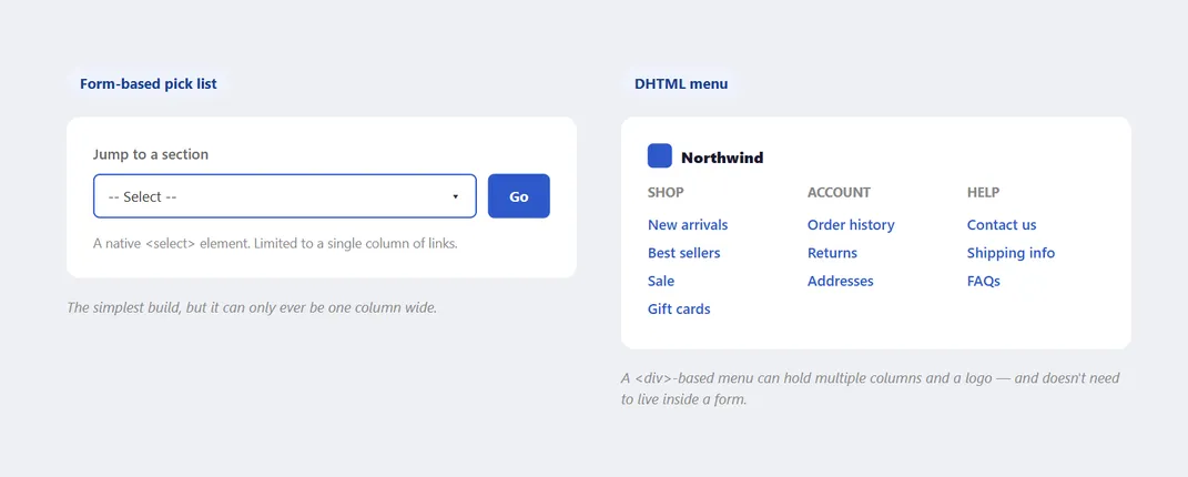 Same collapse-to-save-space idea either way.
- A form-based pick list, when a single column is enough. The easiest to build: a native
<select>element that submits when the customer picks an option, either via an explicit “Go” button beside it or automatically via JavaScript on selection. Automatic submission removes a click but risks navigating a customer away by accident if they select the wrong item without meaning to — many sites keep the Go button regardless, both as a safety net and as a visual cue to the control’s function. A simple pick list is limited to one column of links. - A DHTML menu, for a richer, multi-column layout. Using
<div>elements, this supports a richer layout — multiple columns and rows, additional content like a logo, and doesn’t require the menu to live inside an HTML form. As with any expanding menu, use obvious links inside it and a grid layout to keep it organized and readable, and try to keep its contents above the fold once expanded.
Automatic submission removes a click but risks navigating a customer away by accident if they select the wrong item without meaning to — many sites keep the Go button regardless, both as a safety net and as a visual cue to the control’s function.
Related Concepts
Patterns
Principles
Sources
The Design of Sites: Pattern Group K — Making Navigation Easy (Pattern K16, Jump Menus) is this page’s sole source — the trigger-legibility conventions, the content-organization options, and the form-based-pick-list-vs-DHTML-menu implementation choice.