
Multiple Ways to Navigate
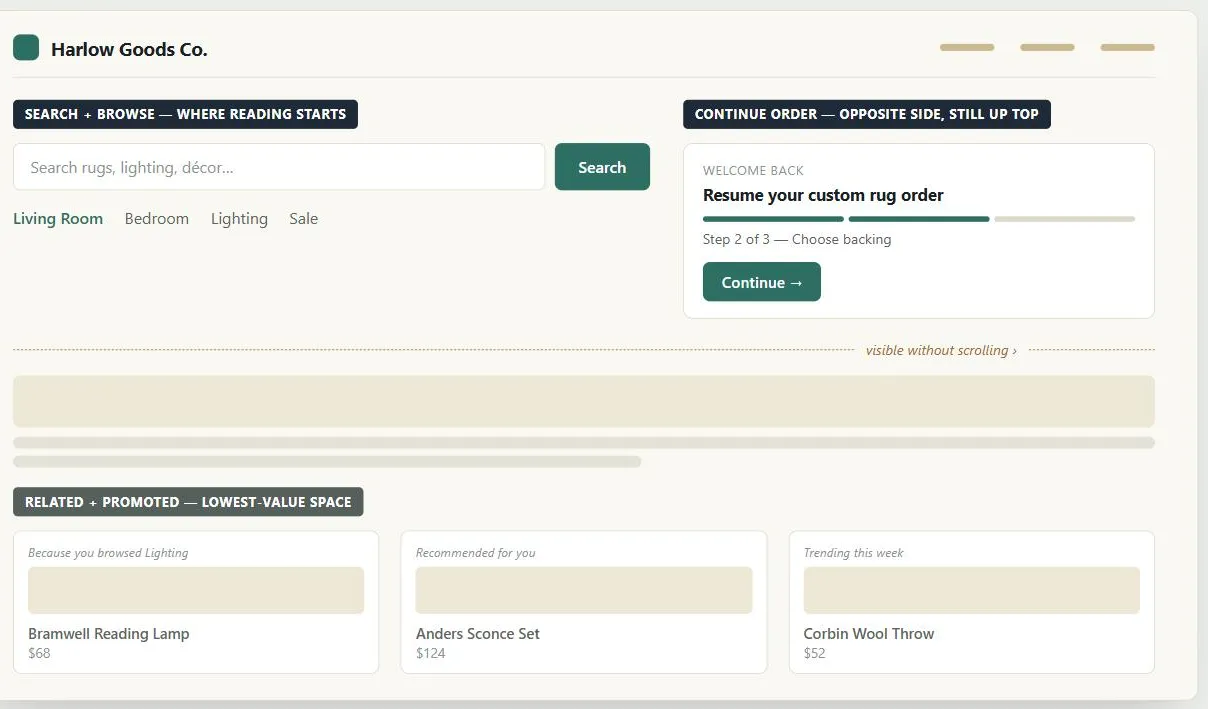 The homepage spends its best real estate on the navigation a visitor is all but certain to use, and holds the rest in reserve for whoever happens to want it.
Background
Customers are driven to act by two distinct motivators — intention (a goal or task they arrived with, from very specific to vaguely “looking around”) and impulse (something that grabs their attention once they’re already on the site, like a promotion or a related item). Neither is inherently better; a site that omits intention-based navigation feels shallow, and one that omits impulse-based navigation feels boring.
Customers are driven to act by two distinct motivators — intention (a goal or task they arrived with, from very specific to vaguely “looking around”) and impulse (something that grabs their attention once they’re already on the site, like a promotion or a related item).
Problem
Customers reach a goal on a Web site in different ways depending on what brought them there in the first place; a site that only supports one of those ways will feel tedious or shallow to everyone else.
Customers reach a goal on a Web site in different ways depending on what brought them there in the first place; a site that only supports one of those ways will feel tedious or shallow to everyone else.
Solution
Offer a distinct navigation style for each motivator
Support both motivators with distinct navigation styles, each suited to a different one:
- Search and browse (intention) — the familiar styles for someone who already knows, or roughly knows, what they want. See Search Action Module and Straightforward Search Forms for search; Browsable Content and Navigation Menus for browse.
- Next-step (“wizard”) (intention) — guiding someone step by step toward a goal that requires more than one decision; see Process Funnel for the canonical strict version of this.
- Relate and promote (impulse) — surfacing related items or promotions that someone wasn’t looking for but might act on anyway; see Consistent Sidebars of Related Content.
Placement follows the same logic as the motivator itself
- Intention-driven tools (search, browse) need to be near where customers start reading, since these are the tools that get a visit started — losing them to obscurity loses the visit.
- Next-step tools that continue a goal already in motion belong near the top but on the opposite side from where reading starts (conventionally top right), so they’re visible without scrolling but don’t compete with the starting point; they’re often repeated at the bottom too, since that’s where attention naturally ends up after scanning the whole page.
- Impulse-driven tools (relate, promote) get the least valuable screen space — lower on the page, or opposite the starting point — precisely because you can’t guarantee a customer will act on them the way you can expect them to use an intention-driven tool they came looking for.
Impulse-driven tools (relate, promote) get the least valuable screen space — lower on the page, or opposite the starting point — precisely because you can’t guarantee a customer will act on them the way you can expect them to use an intention-driven tool they came looking for.
The homepage is where this pattern is under the most pressure: it has to make every one of these styles findable at once, in the page with the least room to spare.
Related Concepts
Patterns
- Browsable Content
- Navigation Menus
- Search Action Module
- Straightforward Search Forms
- Action Buttons
- Process Funnel
- Consistent Sidebars of Related Content
- Grid Layout
- Homepage Portal
Processes
Sources
The Design of Sites: Pattern Group B — Creating a Navigation Framework is this page’s sole source, its B1 pattern — the intention/impulse motivator framework and the search/browse/next-step/relate/promote navigation styles, along with the placement logic tying each style to where it sits on the page.