
Plain Language
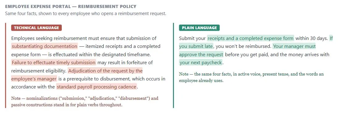 Same four facts, same order — the highlighted phrases on the left are what the highlighted phrases on the right replace.
Problem
Writing at the wrong level for its audience — below their expertise (patronizing) or above it (inaccessible) — fails the reader, and content that isn’t organized for how people actually read online (scanning headings, stopping partway down a page) buries what matters most.
content that isn’t organized for how people actually read online (scanning headings, stopping partway down a page) buries what matters most.
Solution
Plain language is writing that the intended reader can find, understand, and use on first reading. It is not about simplifying or “dumbing down” — it is about matching complexity to the audience’s actual knowledge level and organizing information so readers reach what they need without unnecessary effort.
Plain language is writing that the intended reader can find, understand, and use on first reading.
Write for your audience first
Every plain language decision begins with who the reader is and what they need to accomplish. A guide for pharmacists and a guide for patients describing the same medication can share no word choices and no sentence structure while remaining equally accurate.
Lead with what matters
The inverted pyramid puts the most important information first and supporting detail after. Online, users frequently stop reading partway through a page; if the key finding is buried at the end, many will miss it. Long documents should summarize their key points up-front so readers can navigate to the section they need rather than reading sequentially.
Online, users frequently stop reading partway through a page; if the key finding is buried at the end, many will miss it.
Cover one topic per section
One topic per section, introduced by a topic sentence that tells the reader what the section covers. A reader scanning headings and opening sentences should be able to construct the main argument without reading all body text — this is how digital reading works in practice. See Content Organization Schemes for how this principle scales to site-wide Information Architecture.
Choose words that fit the audience and stay consistent
- Adapt tone to context, but keep voice consistent. A product’s voice — its underlying personality and point of view — should stay the same everywhere it appears, while tone (word choice, sentence length, formality) shifts to fit the situation. An error message earns economical, direct phrasing, often fragments rather than full sentences, because a customer who just hit an error wants the fastest path to a fix; an onboarding flow earns fuller sentences and a warmer, more explanatory tone, because a new customer benefits from context a returning one doesn’t need. The same underlying voice produces both — only the tone adapts.
- Use active voice to make clear who does what: “The agency will review your application within 30 days” rather than “Applications must be reviewed within 30 days.” Passive voice conceals the actor and creates ambiguity about responsibility. The test: passive voice typically contains a form of “to be” (is, was, were, has been) plus a past participle ending in “-ed.” Exception: passive is appropriate when there is genuinely no identifiable actor (e.g., a legal consequence with no named party), or when the true subject of the sentence is a system and the human actor is incidental — “The database needs to be rebooted” reads more naturally than naming who does the rebooting.
- Avoid nominalizations (hidden verbs): converting actions into nouns adds words without adding meaning — “conduct an analysis of” → “analyze,” “make a recommendation” → “recommend,” “provide assistance to” → “help,” “take into consideration” → “consider.” Common signals: endings in -ment, -tion, -sion, -ance, or pairings with “conduct,” “achieve,” “make,” “take.”
- Prefer plain words over jargon. Use the term the audience already knows, not the technical term that requires explanation. When technical precision is genuinely required, introduce the term plainly on first use. Use that term consistently — rotating synonyms for stylistic variety forces readers to track that “remittance,” “payment,” and “transfer” all mean the same thing. Learn the audience’s actual vocabulary directly, through the same observation and interview techniques used for any other customer research, and cross-check candidate terms with card sorting — as a rough starting point where audience expertise is unknown, writing at a ninth- or tenth-grade reading level suits most general-audience sites, adjusted up or down once real research on that specific audience is available.
- Stick to terms your customers already use elsewhere on the Web, not just internally consistent ones. Nearly every site calls its purchase-holding area a “Shopping Cart” or “Shopping Bag,” the homepage link “Home,” and the search page “Search” or “Find” — matching these established terms costs nothing and saves customers from relearning vocabulary. The reverse also matters: don’t reuse a term customers already associate with something else. A “Home” department in an e-commerce category structure needs a label like “Home Department” or “Household,” because “Home” on the Web already means “return to the homepage,” and reusing it for something else creates exactly the kind of confusion consistent terminology is supposed to prevent. On a large site with several contributors, an internal style guide enforcing one term per concept prevents the same thing (a “notebook computer” here, a “laptop computer” there) from splintering on its own. The same discipline applies to action-verb labels specifically — see Action Buttons.
- Use sentence-case capitalization. Capitalize only the first word of a UI string, plus any genuine proper nouns within it — “Email address,” not “Email Address” or “EMAIL ADDRESS.” Title Case requires every writer to apply complex, subjective judgment about which words count as “important” enough to capitalize, and it’s slower to read because it erases the capitalized/lowercase contrast readers otherwise use to spot proper nouns at a glance. ALL CAPS is slower still: capital letters are all the same height with no ascenders or descenders to tell them apart, and take up more horizontal space per letter than mixed case. Reserve capitals for actual proper nouns — product and brand names, company names, people, places, acronyms and initialisms — not a word someone merely feels is significant.
- Default to second person, except for the user’s own data. Address the reader as “you”/“your” by default — it’s more direct and engaging than first person (“we,” “our”), which centers the writer rather than the reader. The one common exception: a label or heading that specifically names content belonging to the user — “My account,” “My usage” — conventionally stays first person in the label itself, while any explanatory text below it switches back to second person (“Your usage is calculated from the first day of the month”).
- Use precise terms of ability, and use politeness sparingly. “Can” expresses ability; “may” expresses permission (and sometimes uncertainty) — using “may” to mean “can” reads as more tentative than intended. Where either “may” or “might” would work grammatically, “might” avoids “may“‘s permission/possibility ambiguity. Terms of politeness (“please,” “thank you”) aren’t neutral filler: reserve them for moments that actually inconvenience the reader — a wait, an interruption — rather than defaulting to them everywhere, since overuse dilutes their meaning and isn’t read the same way across all cultures.
- Use present tense over past or conditional: “This section describes the requirements” rather than “This section would describe the requirements.” Present tense is more direct and eliminates the uncertain register that makes writing feel provisional.
- Avoid hype and self-promotion. Present facts plainly rather than asserting superlatives (“the best,” “revolutionary”) — readers who found a page through search can research competitors just as easily, so overselling in the copy itself reads as a credibility risk rather than persuasion. See Trust and Credibility for the broader honest-communication case this specific instance falls under. Since online readers frequently stop partway down a page (see the inverted pyramid, above), a headline and opening line need to work as a self-contained hook — see Headlines and Blurbs for the specific writing craft of that hook and where it’s stored so it can be reused wherever the content is promoted.
Design content for how people actually read online
- Use headings as navigation. Headings function as navigation in digital content: users scan headings until something matches their need, then drop into that section. Descriptive headings — ones that tell the reader exactly what a section contains rather than generic labels like “Background” or “Introduction” — allow this scanning to work. See Clear First Reads for how heading hierarchy interacts with Visual Hierarchy.
- Use lists to aid scanning. Lists convert parallel prose into scannable items. When three or more things appear in sequence (“you must do X, Y, and Z”), a list is almost always clearer than a sentence. Lists enable vertical scanning rather than linear reading. Use a numbered list when the sequence matters (steps in a process) and a bulleted list when it doesn’t (a set of options); apply bullets sparingly enough that they keep their attention-drawing effect — a page that is mostly bullets loses the contrast that makes any one list stand out, and a single list longer than about seven items usually reads better split or regrouped.
- Use tables for comparisons. Tables clarify comparison data: when users need to compare multiple options across the same attributes, a table exposes the structure more clearly than repeated prose. Tables require parallel, consistent row and column labels — inconsistency defeats the comparison and forces reading instead of scanning. See Data Tables for marking that structure up correctly (row/column headers, captions, numeric alignment) once the decision to use one is made.
- Use emphasis sparingly. Bold and italics signal critical information. Used sparingly, it draws the eye; used throughout, it loses signal value and reads as visual noise. Two forms to avoid entirely: ALL CAPS (see sentence-case capitalization, above) and underline for non-link text (online readers associate underline exclusively with hyperlinks, so non-link underlines cause confusion and false clicks).
- Add white space. White space between paragraphs and sections reduces perceived density. An unbroken block of text raises the entry cost to reading; visual breathing room lowers it. See Cognitive Load for the psychological mechanism behind why density creates resistance.
Test your content
Testing whether content is clear is distinct from checking whether it is correct. Two primary methods:
- Paraphrase testing, for short pages and individual sentences — ask individual readers to restate content in their own words immediately after reading. Where the paraphrase diverges from the intended meaning, the language failed — not the reader. Effective for short pages, form instructions, and individual sentences. Five to eight readers surface most language failures.
- Usability testing, for longer documents, sites, and forms — have users complete real tasks using the content. More effective than paraphrase testing for longer documents, websites, and forms because it surfaces findability failures (the user understood the sentence but couldn’t locate it) alongside comprehension failures. See Usability Evaluation Methods for session structure.
Test iteratively: test early with drafts, not just finished content. Correct based on findings, then retest with a fresh set of readers. Focus groups are the wrong tool for clarity testing — they measure attitudes and reactions (“I find this confusing”) rather than actual comprehension failures, and group dynamics can distort responses. See also Form Design for how plain-language principles apply to labels and hints, and Error Messages for error messages in forms specifically.
Related Concepts
Patterns
- Content Organization Schemes
- Browsable Content
- Form Design
- Clear Typography
- Clear First Reads
- Headlines and Blurbs
- Shopping Cart
- Action Buttons
- Data Tables
- Error Messages
Principles
- Accessibility
- Cognitive Load
- Trust and Credibility
- Visual Hierarchy
- Information Architecture
- White Space
Processes
Further reading
Steve Krug’s Don’t Make Me Think, Revisited (3rd edition, amazon.com/dp/0321965515 — commercially published, no stated open license) makes the underlying case for this section’s whole approach: people scan pages rather than read them and satisfice on the first reasonable option rather than the best one, distilled into his own rule of thumb — get rid of half the words on a page, then get rid of half of what’s left.
Schade, Cheng, and Sherugar’s Top 10 Enduring Web-Design Mistakes (Nielsen Norman Group, 2016 — copyright NN/g, no open license; https://www.nngroup.com/articles/top-10-enduring/) names “overwhelming users with information” — dense text walls and overloaded pages that impede scanning — as one of ten recurring mistakes, corroborating this page’s own scanning-oriented guidance.
Sources
Plain Language Guide (Digital.gov / PLAIN) (public domain, US government work) is this page’s primary source for the audience-first and testing guidance, and for the active-voice, present-tense, and anti-nominalization writing rules covered under Choose words that fit the audience and Test your content.
The Design of Sites: Pattern Group K — Making Navigation Easy supplies the “familiar language” guidance behind Stick to terms your customers already use elsewhere on the Web — matching established Web vocabulary like “Shopping Cart” and “Home” rather than inventing new terms.
The Design of Sites: Pattern Group D — Writing and Managing Content is the source of the inverted-pyramid framing under Lead with what matters, along with the hype-avoidance guidance under Avoid hype and self-promotion and the roughly-seven-item list-length guidance under Use lists to aid scanning.
Carbon Design System: Accessibility, Content, Color, Motion, Spacing, and Icon Guidelines (IBM) (Apache License 2.0) supplies the sentence-case capitalization, second-person default, can/may/might, and sparing-politeness rules under Choose words that fit the audience and stay consistent, plus the voice-versus-tone distinction opening that same subsection.