
Valuable Company Sites
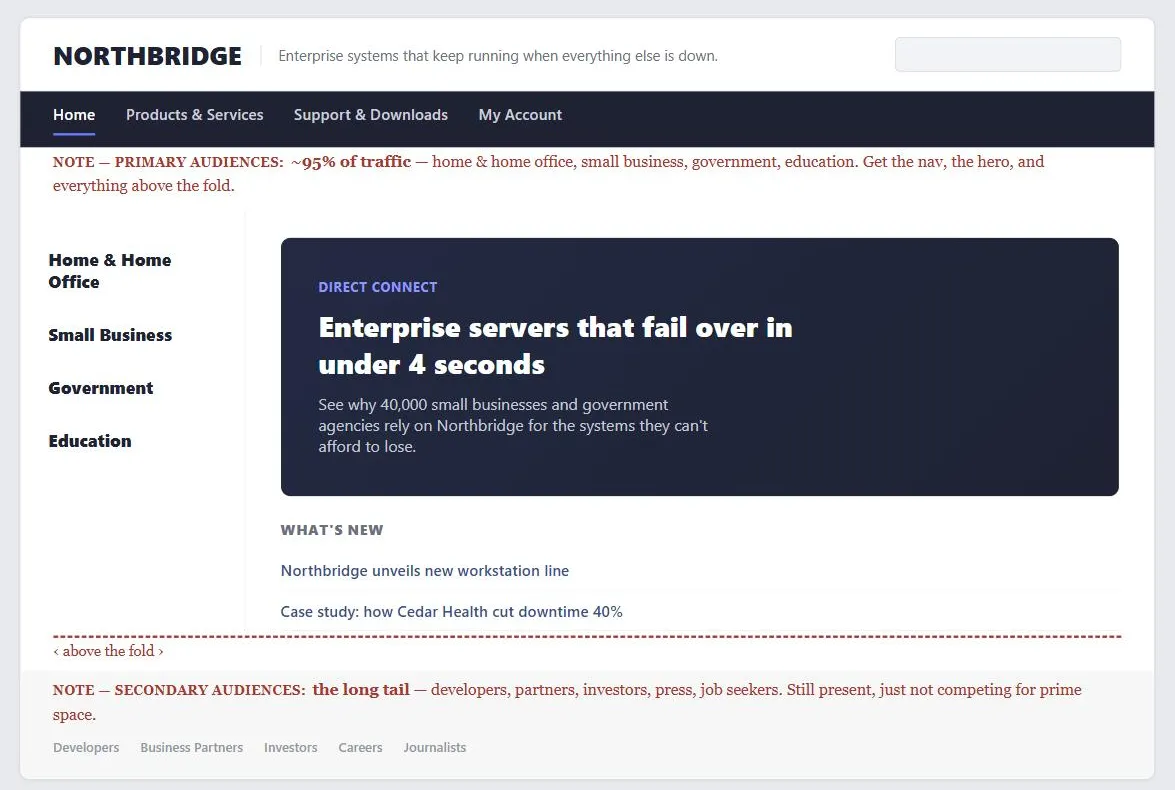 The red serif lines are annotations, not page content — they name which audience is which so the fold line’s consequence (nearly the whole page for one, a thin strip for the other) doesn’t have to be inferred.
Problem
A company site has to serve several very differently-sized audiences at once — customers, partners, press, investors, potential employees — and treating every audience as equally deserving of prime homepage real estate crowds out the audience that actually makes up most of the traffic.
A company site has to serve several very differently-sized audiences at once — customers, partners, press, investors, potential employees — and treating every audience as equally deserving of prime homepage real estate crowds out the audience that actually makes up most of the traffic.
Solution
The central design decision is allocating homepage space in proportion to audience size, per the 95/5 rule below.
Allocate space by the 95/5 rule
Dedicate roughly 95% of the homepage area and links, above the fold, to the visitor groups that make up roughly 95% of actual traffic, and keep the remaining space for the long tail of smaller audiences (press, investors, job seekers). Below the fold is where those smaller-audience links belong — still present, still findable, just not competing with the primary audience’s needs for the most valuable space on the page. This is a direct extension of up-front value proposition and Above the Fold thinking applied specifically to multi-audience homepages.
Skip the splash screen
A splash screen — a heavy, often multimedia opening screen shown before the actual homepage — cannot serve a valuable company site, because it forces every visitor through the same experience regardless of which of the very different audiences above they belong to. Product demos and brand presentations still have a place, but as a self-selected destination a visitor chooses to click into, not as a mandatory first screen.
A splash screen — a heavy, often multimedia opening screen shown before the actual homepage — cannot serve a valuable company site, because it forces every visitor through the same experience regardless of which of the very different audiences above they belong to.
Organize around customers, not around your org chart
A company’s internal department structure is not a usable site information architecture — what makes sense to internal teams (who owns what budget, which department a product belongs to) routinely doesn’t match how a customer thinks about what they need.
A company’s internal department structure is not a usable site information architecture — what makes sense to internal teams (who owns what budget, which department a product belongs to) routinely doesn’t match how a customer thinks about what they need.
Don’t expand branding space at navigation’s expense
The clear first read on a company homepage is usually the brand itself (logo, top-left), with the value proposition as the second read — if the value proposition isn’t clear from those two elements alone, the fix is sharpening the branding and value proposition, not claiming more homepage space for them at navigation‘s expense.
Segment within an audience
Even a single named audience usually splits into subgroups with different questions — investors split into institutional vs. direct, a product buyer splits into decision-maker, recommender, and technical reviewer. Once a visitor is identifiable as an existing customer, route them directly to their account rather than making them read through content aimed at prospects.
Answer the standard questions
Regardless of audience, a company site needs to answer: what does this company offer, what’s new, who uses it, how do I buy or partner, what’s the company’s background, and is there a job for me — typically resolved through About Us content, product/service listings, testimonials and case studies, and an email newsletter to maintain contact with visitors who aren’t ready to convert yet.
Related Concepts
Patterns
- Homepage Portal
- Up-Front Value Proposition
- Clear First Reads
- Above the Fold
- Multiple Ways to Navigate
- Account Management
- Email Communications
- About Us Pages
- Blogs
Principles
Sources
The Design of Sites: Pattern Group A — Site Genres is this page’s A7 pattern source — the 95/5 homepage-space allocation rule, the case against splash screens, and organizing site structure around customer needs rather than internal org-chart divisions.