
Fitts’s Law
Overview
A foundational human-computer interaction (HCI) law from psychologist Paul Fitts’s 1954 study (Journal of Experimental Psychology), proposing a metric for how hard it is to select a target by pointing at it. In plain terms: the time needed to move to and select a target depends on how far away it is and how big it is — closer, bigger targets are faster to acquire; farther, smaller ones take measurably longer. This is the underlying principle behind several patterns favoring large, nearby clickable targets, such as Organized Search Results‘s large pagination links, Accessibility‘s motor-control discussion, and Above the Fold‘s case for keeping a page’s most critical action within reach rather than a long scroll away, even where those pages don’t name the law explicitly.
The time needed to move to and select a target depends on how far away it is and how big it is — closer, bigger targets are faster to acquire; farther, smaller ones take measurably longer.
The relationship
Formally, movement time (MT) relates to distance (D, the gap between the starting position and the target’s center) and target width (W, the target’s size along the direction of movement) as MT = a + b·log₂(2D/W), where a and b are empirically fitted constants. The log₂(2D/W) term is called the index of difficulty — practically, what matters for design is just the shape of the relationship: difficulty rises with distance and falls with size, and it does so on a logarithmic curve, so the easy early gains (going from tiny to small) taper off faster than naive intuition suggests.
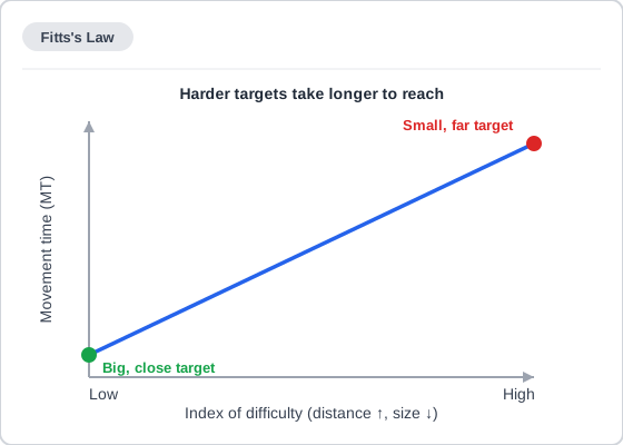 Once distance and size are folded into one difficulty number, the relationship to movement time is a straight line — the log₂ curve is already baked into the x-axis itself.
Design implications
Make targets bigger, not just visible
A target’s effective size is what’s clickable, not just what’s visually drawn; padding a small icon’s clickable area is a direct application (already covered, without naming the law, in Organized Search Results and the Accessibility motor-control discussion).
The same idea scales up past individual icons: a content card that visually reads as one unit (e.g. a “Reviews” summary box) but wires up only a small nested “View” button as the actual click target forces users to aim for a much smaller area than the card’s own visual size suggests — making the entire card clickable is a small HTML change that closes the gap between what looks clickable and what is. A target that demands close attention to hit also splits cognitive resources between the pointing task itself and whatever task the click was meant to accomplish.
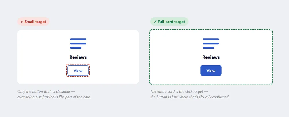 Both cards look identical — the difference is entirely in how much of that visual size is actually clickable.
Add a text label to widen an icon-only target
Pairing an icon with a text label doesn’t just add clarity about what the control does — the label itself extends the clickable area horizontally, giving Fitts’s Law’s size term (W) more to work with than the bare icon alone would. An icon-only button is functionally a small, hard-to-hit square; the same icon with a label next to it becomes a wider target without the icon itself changing size at all.
The rule of the infinite edges
A target placed flush against a screen edge is effectively infinite in size along that edge, since the cursor can’t overshoot past it. macOS’s top-of-screen menu bar relies on exactly this.
A target placed flush against a screen edge is effectively infinite in size along that edge, since the cursor can’t overshoot past it.
Magic corners
A screen corner is where two infinite edges meet, making it the single easiest target on the entire screen; Windows and Microsoft Office both place high-value controls (e.g. the Start button, the Office button) in corners for this reason.
Touchscreens raise the stakes
A fingertip is far less precise than a mouse cursor, so the same target-size guidance matters even more on mobile, where targets also can’t rely on hover states to compensate for imprecision. Concrete numbers: Material Design’s minimum touch target is 48×48dp (roughly 9mm of physical screen space regardless of device, within a 7–10mm recommended range); iOS’s equivalent recommendation is 44×44pt. Pointer targets (mouse, stylus) can go slightly smaller, at least 44×44dp, since a pointer is more precise than a fingertip.
A target’s touch area doesn’t have to match its visual size — a 24×24dp icon can sit inside a full 48×48dp touch target via padding, the same “effective size beyond the visible drawing” idea as Make targets bigger, not just visible above. Adjacent touch targets should keep at least 8dp of space between them, since insufficient spacing raises the odds of hitting a neighboring target instead of the intended one — a version of the same imprecision problem the target-size guidance addresses, just measured between targets rather than within one.
A wearable’s smaller screen and less-stable one-handed grip push the same target-size math even further, which is why its gesture shortcuts still need a visible, tappable fallback of adequate size rather than relying on the gesture alone. A spatial interface’s targets face the opposite problem — the target itself may be meters away — so the same imprecision-compensation principle calls for sizing even more generously there, not less.
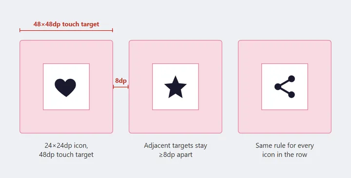 The touch target is drawn much larger than the icon sitting inside it — the same effective-size idea as the Reviews-card example above, just with concrete numbers attached.
Consider radial/pie menus
These put every option at the same distance from the click point, minimizing the worst-case distance rather than just the average — though handedness still matters (right-handed users select items on their left less efficiently than the right).
Limitations
The model’s accuracy degrades when distance and width both vary across a wide range within the same comparison, and the original one-dimensional formulation needs adjustment for real two-dimensional pointing (a target isn’t just “far” or “close,” it has both a width and a height relative to the movement direction). Applying it to eye-tracking/gaze-based interaction is contested, since rapid involuntary eye movements (saccades) don’t behave like the deliberate, correctable hand movements the law was modeled on.
Connections to other laws
- Hick’s Law — a complementary law about decision time rather than movement time: choosing among more options takes longer, roughly logarithmically in the number of choices. Where Fitts’s Law governs getting to a target, Hick’s Law governs deciding which one to go to; see Hick's Law for its own formula and design implications.
- The (Accot–Zhai) steering law — extends Fitts’s Law from selecting a single point target to navigating through a constrained path (e.g. a hierarchical pull-down menu, where the cursor has to stay within a corridor the whole way, not just land on an endpoint).
- Throughput — a related metric combining a task’s index of difficulty with the time it actually took, expressed in bits per second, used to compare pointing performance across input devices or populations.
Where Fitts’s Law governs getting to a target, Hick’s Law governs deciding which one to go to; see Hick's Law for its own formula and design implications.
Related Concepts
Patterns
- Organized Search Results
- Action Buttons
- Form Design
- Above the Fold
- Wearable Interface
- Spatial Interface
Principles
Processes
Further reading
Victor Ponamariov’s 50 Tips to Improve User Interface (goodreads.com/book/show/58085971-50-tips-to-improve-user-interface — self-published ebook, no stated license) applies this law in concrete tips such as replacing gallery slider dot indicators with larger clickable areas or navigation arrows, since dots fail badly as touch targets.
Bruce Tognazzini’s First Principles of Interaction Design (asktog.com — no stated open license) credits Fitts’s Law with correctly predicting that the classic Macintosh pull-down menu was measurably faster to acquire than the old Windows equivalent.
Paul Fitts’s original “The Information Capacity of the Human Motor System in Controlling the Amplitude of Movement” (Journal of Experimental Psychology, 47(6), 381–391, 1954 — commercially published, no stated open license) is the paper the law is named for: a series of stylus-tapping experiments treating rapid, aimed movement as an information-channel problem, the underlying model both Ponamariov’s and Tognazzini’s applied guidance above ultimately rests on.
Sources
Fitts's Law (Wikipedia) (CC BY-SA) is this page’s primary source for the MT = a + b·log₂(2D/W) formula, the index-of-difficulty term, and the rule of the infinite edges and magic corners covered above.
The Design of Sites: Glossary contributed Fitts’s Law as one of the UX/design-process terms in its own cross-checked terminology sweep, grounding this page’s Overview definition against the book’s own usage.
Accessibility (Material Design) (Apache License 2.0) is the source for the touchscreen target-size figures above — the 48×48dp/44×44pt/44×44dp numbers and the 8dp minimum spacing between adjacent targets.
It Just Works: Tiny Details That Matter in UX Design supplies the “Reviews” summary-card example illustrating why a card’s full visual area, not just its nested “View” button, should be the actual click target.
Fitts's Law: Why Every UX Practitioner Should Know It supplies Add a text label to widen an icon-only target above, and the Above the Fold cross-reference in the Overview linking a critical action’s page position to the distance term the formula’s D measures.