
WAI-ARIA (Accessible Rich Internet Applications)
One of WAI‘s five specification families, alongside Web Content Accessibility Guidelines (WCAG). Where WCAG covers content generally, WAI-ARIA specifically addresses rich Internet applications — custom, JavaScript-driven controls (custom dropdowns, tabs, live-updating regions) and partial-page content updates that plain HTML has no vocabulary to describe. A screen reader can announce a native <button> correctly because HTML already says what it is; it can’t do the same for a <div> that JavaScript has turned into a tab control, because nothing in the markup says “this is a tab, and it’s currently selected.”
A screen reader can announce a native
<button>correctly because HTML already says what it is; it can’t do the same for a<div>that JavaScript has turned into a tab control, because nothing in the markup says “this is a tab, and it’s currently selected.”
What it adds
WAI-ARIA lets a page declare extra metadata on top of existing markup, organized into three kinds:
- Roles — what a component is (e.g. marking a list of links as a navigation region, or a custom widget as a tab).
- Properties — relatively stable characteristics of a component.
- States — its current, changeable condition (e.g. whether a menu is expanded or collapsed right now).
This metadata feeds the accessibility tree — the structured representation of a page that assistive technology actually reads, separate from (but built from) the visual DOM — letting a screen reader or other tool present a dynamic custom widget as meaningfully as it would a native one.
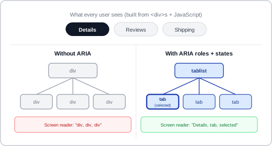 Same markup, same three tabs — the accessibility tree just tells a screen reader what they actually are.
The first rule: prefer native HTML
WAI-ARIA’s own guidance is explicit that it’s a fallback, not a first choice — codified as the Five Rules of ARIA:
- Don’t use ARIA if the same semantics are achievable with a native HTML element or attribute.
- Don’t change the semantics of native HTML, unless there’s no real alternative.
- Every interactive ARIA control must be usable with the keyboard alone.
- Don’t remove semantics or hide focusable elements (e.g. applying
role="presentation"oraria-hidden="true"to something a keyboard user can still tab to). - Every interactive element needs an accessible name.
Rule 5’s “accessible name” is a concrete, recurring craft problem in its own right — see Action Buttons for how to write one that describes an action rather than an icon’s appearance, and how to phrase it for a toggling control specifically.
The consensus reason for rule 1 specifically: incorrect or contradictory ARIA actively misleads assistive technology in a way that absent ARIA doesn’t — “bad ARIA” is worse than “no ARIA.” This is the same design discipline Accessibility already argues for with color and clickable targets: prefer the option that can’t be gotten subtly wrong over a more powerful one that can.
The consensus reason for rule 1 specifically: incorrect or contradictory ARIA actively misleads assistive technology in a way that absent ARIA doesn’t — “bad ARIA” is worse than “no ARIA.”
A worked example: the combobox pattern
The combobox pattern shows the roles/properties/states model applied to a real, common widget: an editable input paired with a suggestion popup. role="combobox" marks the input; aria-expanded tracks whether the popup is currently visible; aria-controls points at the popup element; and aria-activedescendant lets a screen reader announce which suggestion is focused while DOM focus stays on the input itself, rather than actually moving into the popup. aria-autocomplete (none/list/both) tells assistive technology which of the pattern’s autocomplete behaviors is actually implemented, so it doesn’t announce capabilities the widget doesn’t have.
The pattern also illustrates why states matter separately from roles: pressing Escape dismisses the popup without changing a value the customer already committed to — the combobox’s aria-expanded state changes, but its value doesn’t — whereas a plain listbox has no such distinction, and moving focus among its options changes the selected value immediately with no way to back out.
Version history
WAI-ARIA work began in 2006 (first published September 26, 2006); WAI-ARIA 1.0 reached W3C Recommendation status March 20, 2014; 1.1 followed December 14, 2017; 1.2 reached Recommendation status June 6, 2023.
Related Concepts
Patterns
Principles
Standards
Sources
WAI-ARIA (Wikipedia) is the source for the roles/properties/states breakdown, the accessibility-tree explanation, the Five Rules of ARIA, and the version-history dates.
Combobox Pattern (W3C WAI-ARIA Authoring Practices Guide) is the source for the combobox worked example above — W3C’s own authoring-practices pattern, not a secondary summary of it.