
Notifications
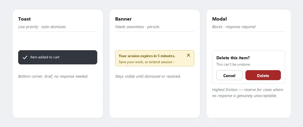 Three patterns, three levels of urgency — matching the pattern to the urgency is what prevents alert fatigue.
Problem
Getting notification presentation wrong causes real harm in both directions: too many notifications, or notifications shown with more urgency than they warrant, cause alert fatigue and train users to dismiss without reading — including the ones that actually matter; too few, or notifications that are easy to miss, leave users unaware of things they needed to know.
Too many notifications, or notifications shown with more urgency than they warrant, cause alert fatigue and train users to dismiss without reading — including the ones that actually matter; too few, or notifications that are easy to miss, leave users unaware of things they needed to know.
Solution
Notifications communicate system events to users outside the normal flow of interaction — status changes, confirmations, warnings, and prompts that need attention without necessarily interrupting ongoing work. The core design variables are: how urgent is the information? Does it require a response before work can continue? And how long should it persist?
Match notification type to urgency
Three patterns cover most cases, distinguished by urgency and whether a response is required:
- Toasts, for low-priority, auto-dismissing messages. Transient, low-priority messages that appear briefly at the edge of the screen and auto-dismiss after a short timeout (typically 3–5 seconds). Used for confirmations and non-critical status updates: “Item added to cart,” “Settings saved,” “Message sent.” Because they disappear automatically, they must not require a user response, and must not carry information the user will need again — if a toast is missed, no harm results. They should still be manually dismissible. Position is conventionally bottom-left or bottom-center on desktop; consistency matters more than the specific edge chosen — but a fixed, far-from-action position can still cost a toast its whole purpose, since a confirmation that appears well away from wherever the user just clicked risks going unnoticed the same way any other easy-to-miss change does.
- Banners, for persistent warnings that need action. Persistent messages that remain visible until the user explicitly dismisses them or until the triggering condition resolves. Used for warnings or states that require action before the user can proceed safely: “Your session expires in 5 minutes,” “Payment method declined,” “Storage limit reached.” Because banners persist, they suit information it would be harmful to miss. They should include a clear action or dismiss Affordance and should not block content unnecessarily.
- Modals, reserved for responses that must happen before work continues. See Modal Dialogs. Used only when a response is required before work can continue: destructive confirmations, authentication prompts, critical errors that block the current flow. The highest-friction pattern; reserve it for cases where a non-response is itself unacceptable.
The status indicator cycle in Auto-save (“Saving…” → “All changes saved” → “Save failed — Retry”) is a toast/banner pattern applied to a specific domain: routine progress is a quiet transient toast; failure is a persistent, actionable banner. A wearable notification adds a further filter on top of urgency alone: whether the interruption is worth buzzing a wrist for at all.
Avoid alert fatigue
When too many notifications fire — or when non-urgent notifications are presented at the same visual weight as urgent ones — users begin dismissing without reading. This degrades the signal value of all notifications, including urgent ones, because the brain learns that dismissing is the right response. The corrective is consistent severity routing: low-priority events get toasts, warnings get banners, blocked states get modals. Using a modal for a routine confirmation, or a banner for a passing status message, trains the wrong dismiss reflex.
When too many notifications fire — or when non-urgent notifications are presented at the same visual weight as urgent ones — users begin dismissing without reading.
See Interface Design Principles (principle 2) for the underlying framing: notifications are system feedback, and the same principle that requires feedback to be informative also implies it must be selective. Feedback that fires constantly becomes noise; the gulf of evaluation opens whenever notifications are so frequent or poorly timed that users can no longer tell meaningful signal from background chatter.
Give users control over notifications
Manageable notifications give users control over which events trigger notifications and through which channels. Patterns:
- Opt-out defaults: notifications enabled by default, with a settings panel to disable categories. Appropriate when the default value is high for most users (order tracking, security alerts).
- Opt-in defaults: notifications disabled until the user enables them. Appropriate for high-frequency or high-interruption channels (email, push), where unsolicited notifications consistently produce negative reactions.
- Digest mode: daily or weekly summaries rather than real-time per-event messages. Reduces interruption for categories where recency matters less than coverage.
- Per-channel control: the same event routed to multiple channels (in-app + email + push) compounds interruption for the same information. Giving users independent control per channel avoids both over-notification and missed notifications.
Notification settings buried deep in an account panel are rarely discovered. A contextual preference prompt — surfaced inline immediately after the first notification fires — is more likely to be acted on than a buried settings page. The prompt itself should not be a modal dialog; an inline banner or tooltip is sufficient for a non-urgent preference question.
Reserve page-level banners for service-wide alerts
Notification banners are page-level persistent alerts positioned above the page heading, used for service-wide information that is unrelated to the user’s current task — processing delays, deadline reminders, overdue actions. They differ from inline banners (which relate to the current page’s task) and error messages (which relate to a specific form field).
Two modes reflect urgency and role:
- Neutral (typically blue): informational, no focus shift on load. Used for service problems and background context the user should be aware of.
- Success (typically green): confirms the expected outcome of a user action from a previous step. Moves keyboard focus to the banner on load so the confirmation is announced. Must be removed when the user navigates to a new page — a success banner left on subsequent pages becomes confusing context. A genuinely reassuring, specific success message carries outsized weight in how the whole preceding flow gets remembered, per the Peak-End Rule.
The two modes carry different ARIA roles, matching the focus behavior above: role="region" lets a screen reader user find the banner by navigating landmarks, at their own pace, without interrupting whatever they’re doing — the right fit for the neutral mode’s no-focus-shift behavior. role="alert" instead announces immediately and unprompted, matching the success mode’s focus shift:
<!-- Neutral: no focus shift -->
<div role="region" aria-labelledby="banner-title">
  <h2 id="banner-title">Important</h2>
  <p>You have 7 days left to send your application.</p>
</div>

<!-- Success: focus moves to the banner on load -->
<div role="alert" aria-labelledby="banner-title">
  <h2 id="banner-title">Success</h2>
  <p>Your application has been submitted.</p>
</div>
Key limitation: there is strong evidence (NNGroup research on banner blindness) that users often miss page-level banners, and the more frequently they appear the less they are read. Use sparingly; never substitute a notification banner for content the user actively needs to complete their current task — for that, use inline content, inset text, or warning text within the page body.
Do not use notification banners simultaneously with an error summary on the same page.
Show form errors in two places
Form validation errors don’t use a notification banner: they pair an error summary at the top of the page with an inline message at each affected field, worded identically — see Error Messages for the full pattern. Prefix the page <title> with “Error:” as well, so screen readers announce the error state before the user reads anything else.
Time push-permission requests to the moment of value
Browser and native push notifications operate outside the site context and require explicit permission — a browser-level dialog the user cannot undo without going into browser settings. Requesting this permission immediately on page load (before the user has any context for why it would be useful) consistently produces high rejection rates, training users to deny reflexively. A better trigger: surface the permission request from a user action that makes the value obvious — completing a purchase that generates a tracking event, subscribing to content, or enabling a feature that depends on push. The request should follow, not precede, the moment of perceived value.
The request should follow, not precede, the moment of perceived value.
Related Concepts
Patterns
Principles
- Interface Design Principles
- Change Blindness
- Gulfs of Execution and Evaluation
- Affordance
- Peak-End Rule
Standards
Sources
GOV.UK Design System (Open Government Licence v3.0) is the source for the notification banner’s two-mode neutral/success behavior — including the role="region"/role="alert" distinction and the rule against leaving a success banner visible after navigation — and for the error-summary-plus-inline-message dual-track pattern, including the requirement that both tracks use identical wording and the page <title>’s “Error:” prefix.