
Homepage Portal
 A single visual accent among five identical gray links signals a deliberate choice about which secondary link still deserves emphasis, not an inconsistency in the styling.
Background
Load time matters more here than on any other page: inner pages benefit from images and assets the browser already cached while loading the homepage first, but the homepage itself never gets that head start — leaning on HTML text, compressed/cropped images, and avoiding splash screens, sounds, and applets keeps load time within the few seconds visitors will tolerate before bouncing to a competitor (see Page Loading Speed for the general pattern, and Interface Design Principles‘s feedback principle for softening an unavoidable wait).
Problem
For a site whose visitors mostly arrive at the front door rather than a deep link, the homepage is seen far more often than any other single page, and must seduce a diverse mix of first-time and returning visitors while simultaneously balancing branding, navigation, content, personalization, and download speed — all within the limited space Above the Fold. That “arrive at the front door” caveat matters more today than it once did: search-driven and bookmarked deep links (see Permalinks) mean plenty of visits now skip the homepage entirely, so its outsized share of traffic isn’t universal across every kind of site.
the homepage is seen far more often than any other single page, and must seduce a diverse mix of first-time and returning visitors while simultaneously balancing branding, navigation, content, personalization, and download speed
Solution
Treat the homepage as a single page that has to do several things at once, and design deliberately for each:
Build site identity and brand
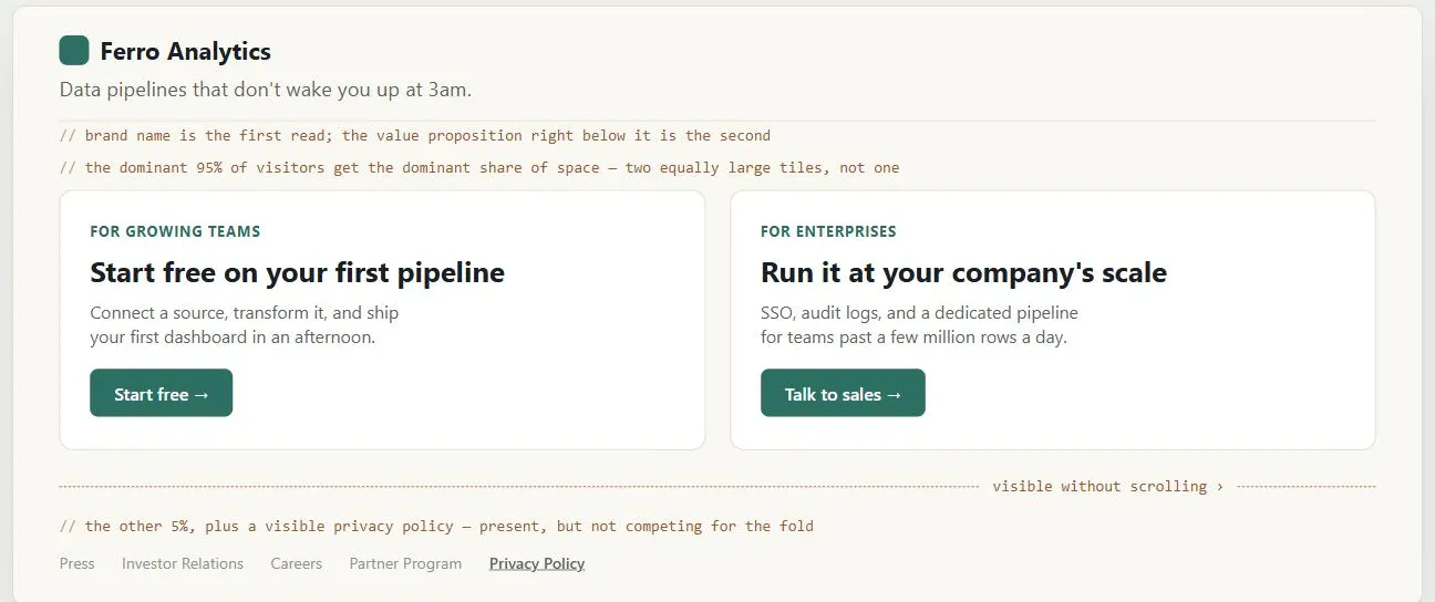
State the Up-Front Value Proposition and reinforce it with site branding and a visible privacy policy, then actually fulfill that promise on every subsequent page.
Get the look and feel right for the target audience
A style mismatched to the audience (e.g. loud, youth-oriented graphics on a serious or conservative site) creates instant doubt that the visitor is in the right place; tune it by repeatedly testing with a dozen-plus members of the intended audience.
A style mismatched to the audience (e.g. loud, youth-oriented graphics on a serious or conservative site) creates instant doubt that the visitor is in the right place; tune it by repeatedly testing with a dozen-plus members of the intended audience.
Seduce with content
Visitors form a fast, lasting impression before they read any of the page in detail, so lead with a catchy headline/blurb or a clear first read, and consider a content-management/publishing system so content modules can rotate without manual upkeep.
Personalize if it’s worth the cost
Personalization (the site adapts content based on data it infers or already holds, e.g. past purchases or browsing history) and customization (the customer explicitly chooses or configures what they see) are related but distinct; either feels faster and more relevant than a one-size-fits-all homepage, but both need more infrastructure (logins, cookies, server/database resources) and only pay off if there’s enough varied content to personalize or customize. Doing either well also requires fair information practices and a clear privacy policy, since customers need to trust the site enough to hand over the data it runs on.
Balance brand space against navigation space
Site branding (top-left) is typically the first read and the value proposition the second, so both need to be unmistakably clear rather than simply bigger; customers skim for recognizable phrases, so invest in wording (descriptive, longer link names) over decoration.
Give the dominant audience the dominant share of space
A “primary audience” is really several subgroups with different questions, so dedicate roughly 95% of above-the-fold space/links to the dominant 95% of visitors and the remaining 5% to everyone else (often via a role-selection subsidiary page). That’s a practical instance of the same progressive-disclosure logic Hick's Law gives a formal basis for: fewer visible choices at once means a faster decision for the visitors who see them.
A “primary audience” is really several subgroups with different questions, so dedicate roughly 95% of above-the-fold space/links to the dominant 95% of visitors and the remaining 5% to everyone else (often via a role-selection subsidiary page).
Make navigation predictable
Customers need to instantly recognize what’s clickable and trust that clicking produces a predictable result; support this with Multiple Ways to Navigate and strong information scent (see Browsable Content for what that term means and how to build it).
Related Concepts
Patterns
- Up-Front Value Proposition
- Grid Layout
- Above the Fold
- Clear First Reads
- Multiple Ways to Navigate
- Browsable Content
- Site Map (Navigation Page)
- Permalinks
- Content Modules
- Privacy Policy
- Page Loading Speed
Principles
Processes
Standards
Further reading
Nielsen Norman Group’s “113 Design Guidelines for Homepage Usability” (commercially published, no stated open license) is a longer, independent checklist for the same branding, navigation, and search balance this page describes, including rules such as never linking the homepage to itself and showing a visible search box rather than a link to one.
Sources
The Design of Sites: Pattern Group C — Creating a Powerful Homepage is this page’s primary pattern source — the C1 pattern’s framing of the homepage as the site’s single highest-leverage page, its competing demands (brand, look-and-feel, personalization, navigation, download speed), and the rule of thumb dedicating roughly 95% of above-the-fold space to the dominant 95% of visitors.
The Design of Sites: Glossary supplies the personalization-vs-customization distinction used under “Personalize if it’s worth the cost” — system-inferred adaptation versus customer-chosen configuration.
The Design of Sites: Pattern Group I — Designing Effective Page Layouts is the source for the above-the-fold space constraint the Problem section frames the homepage’s competing demands within, and for the clear-first-read convention the Solution section leans on for branding placement.