
Spatial Interface
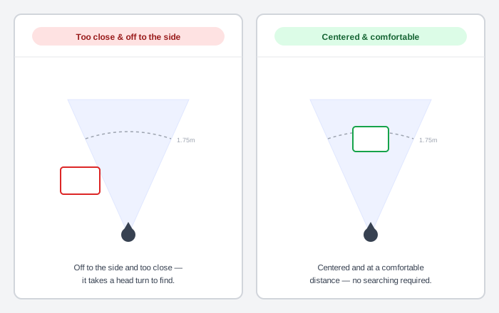 The cone marks the same comfortable field of view in both panels — only the panel’s own placement inside or outside it changes.
Background
A spatial interface places content in three-dimensional space around a person rather than flattening everything onto a single rectangle. A panel floats at a real distance in front of them, a virtual object can be walked around, and the display itself might be fully opaque (a headset) or let the physical room show through (glasses). A wearable shrinks the screen; a spatial interface removes its fixed size and position altogether, trading a familiar flat layout for comfort and safety problems a flat screen never had — sensory mismatch, physical collisions, eye strain among them.
A spatial interface places content in three-dimensional space around a person rather than flattening everything onto a single rectangle.
Problem
Content placed in 3D space around a person can trigger real physical discomfort a flat screen never risked. That includes motion sickness from a mismatch between what the eyes see moving and what the inner ear feels, eye and neck strain from content parked outside a comfortable viewing angle, and physical collisions with real furniture a virtual object was obscuring.
Content placed in 3D space around a person can trigger real physical discomfort a flat screen never risked.
Solution
Design comfort and safety in from the start — placement distance, field-of-view position, motion predictability — rather than treating a spatial layout as a flat interface simply projected onto a 3D canvas.
Place content where the eyes and neck don’t have to work
Center interactive content in a person’s field of view rather than off to the side, so selecting it doesn’t require turning the head or straining the eyes. Spawn a panel at a comfortable distance and angle — a real-world implementation spawns one about 1.75 meters out, centered in the middle 41° of a person’s field of view, with its vertical center 5° below eye level, since people tend to look slightly downward at rest. Let a person adjust height and distance further, since posture and preference vary.
Keep virtual objects clear of real physical space
Keep a virtual object at least a meter away from a person by default, leaving enough room to move without colliding with something real the object might be obscuring. Where full immersion replaces the physical room entirely, still give a person a fast, clearly-signaled way back to it, and reserve that full replacement for moments that genuinely benefit from it rather than making it the default state.
Design motion to avoid sensory mismatch
Motion sickness in a spatial interface comes from a specific mismatch: the eyes perceive movement the inner ear doesn’t feel. Keep camera and object motion smooth and predictable, introduce any new motion mechanic gradually rather than all at once, and build in rest stops — moments of stillness — so a person can recover rather than accumulating discomfort continuously. Reserve a large, sudden movement of the whole environment for when it’s genuinely necessary, and soften it: fade out and back in, narrow a person’s peripheral vision during the transition, or accelerate gradually rather than snapping to full speed. Make an object’s own motion optional to turn down, since sensitivity to it varies by person.
Motion sickness in a spatial interface comes from a specific mismatch: the eyes perceive movement the inner ear doesn’t feel.
Never rely on a single input method
Support more than one way to interact — hand tracking, eye gaze, voice, a physical controller, a keyboard or mouse — rather than assuming everyone has, or wants to use, the same one. Design a hand gesture to mimic a real-world action (picking something up, throwing it) so it’s intuitive without being taught, and keep it small and infrequent enough not to tire an arm held up to perform it repeatedly. Confirm every input method’s action with visible or audible feedback, the same requirement regardless of which method triggered it.
Give every element enough scale and contrast to read at a distance
Content in a spatial interface is read from a distance and angle that shifts as a person moves, not from a fixed, close, flat screen — size and contrast that work up close can fail once a panel is meters away or seen at a steep angle. Keep type no smaller than 14dp and no lighter than a normal weight, and size a target for pointing at a distance at least as generously as a touchscreen target, since imprecision only grows with distance. Test legibility and contrast at more than one distance and lighting condition rather than only the one used while designing.
Design UI color for the display technology it’s actually shown on
An opaque headset display and a see-through pair of glasses need opposite color assumptions: an opaque display can render a true, solid black, while a transparent additive display renders black as invisible and needs brightness to make a color read as solid at all. Design each for its own display rather than assuming one palette works on both, and rely on a device’s own dimming, where available, to keep content readable against a bright real-world background.
Use auxiliary controls and layered elevation sparingly
A floating control anchored to a panel (an orbiter) keeps a secondary action reachable without permanently occupying the panel’s own space — but a person confronted with many floating controls at once experiences the same overload a cluttered flat toolbar would cause. Keep an orbiter close to the panel it controls, and reserve raising an element above the panel’s own surface for something that genuinely needs the extra attention, such as a dialog or popup, rather than applying it decoratively.
Related Concepts
Patterns
Principles
Sources
Android XR Design Guidelines (Android Developers) is this page’s sole source — its comfort/safety design pillars, spatial-placement measurements, motion-sickness mitigation, multimodal-input rules, distance-legible typography and target sizing, display-specific color guidance, and orbiter/elevation restraint all come from Google’s Android XR design documentation.