
Call to Action
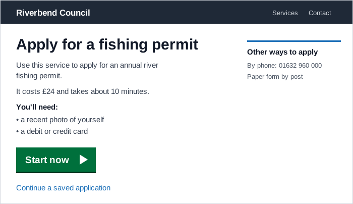 One green start button carries the page’s main next step, while resuming a saved application is offered as a plain link that doesn’t compete with it.
Background
A call to action is the prompt that tells a visitor what to do next on a page, such as “Start now,” “Book an appointment,” or “Find your nearest pharmacy,” whether it’s shown as a button, a link, or a highlighted box. It pairs with a page’s first read: the first read tells visitors what the page is, the call to action tells them what to do about it, and both compete to be the most prominent thing on the page. A call to action needs enough visual weight to be found at a glance. But if it outweighs the first read and the content around it, people can act before they understand what they’re starting.
the first read tells visitors what the page is, the call to action tells them what to do about it
Problem
A page with no clear next step leaves visitors to work out for themselves which of several equally weighted options moves them forward. A government filing portal that shows four equally weighted category cards and only a small secondary “FAQs” button gives nobody a single place to start. The opposite failure is just as common: several calls to action compete for attention on one screen, and each one weakens the others.
Solution
Give each page one primary next step
Decide which single action the page most exists to support, and make that the primary call to action. Everything else on the page is secondary, styled down using the emphasis scale in Action Buttons’s Establish a button hierarchy. A clear, confident call to action is part of what makes a page feel credible at first impression, and too many of them split a visitor’s attention between competing next steps.
On a multi-step task, each step has its own primary next step, and those smaller actions build toward the one that completes the task. Sales and marketing have long used the same sequence, where a run of small, easy requests (pick a style, then a color, then a size) makes the final, bigger request easier to agree to. In a Process Funnel, each step’s call to action plays the small-request role, and the last step’s button closes the task.
Make secondary actions plain links. When a page also needs a second way forward, such as signing in, resuming an application already started, or updating existing details, show it as a standard text link rather than a second button. The secondary path stays available without competing with the primary one for the same visual weight.
Make the call to action that completes a task unmissable
For the one call to action that actually completes a process funnel step (a checkout’s “Place Order,” a form’s “Submit”), ordinary button styling isn’t enough. Customers who scroll past it, or whose browser window is too small to show it without scrolling, can lose track of how to proceed. Three placement rules address this:
- Position it just below the top navigation bar, tab row, or progress bar: close enough to the top to be seen quickly, but not at the very top, where it would compete with the branding customers rely on to recognize the site (see Above the Fold).
- Repeat it below the fold if critical content pushes it out of the initial view, so a customer who has scrolled down to read or check something doesn’t have to scroll back up to act.
- Make it visibly larger than every other button on the page, with a color that contrasts clearly against the background and a label different from every other button’s label. The goal is that a customer scanning the page lands on this button before any other.
Choose the form that matches the action
In web design, a call to action can be a button, a link, a banner, or a graphic. Which one fits depends on what the action does and where it sits:
- Button: for submitting a form or starting a transactional service. A service’s start page leads with a start button whose text matches what the user is being asked to do, such as “Start now,” “Sign in,” or “Register or update your details.” Inside a form, always use a button rather than a link styled as one.
- Action link: a prominent link with an arrow icon, used to signpost the start of a digital service from within ordinary content, such as “Find your nearest A&E” on a health information page. It usually sits within a block of text or inside a highlighted card. It isn’t for simply linking to another page or site. A link that only needs to stand out belongs in an inset text block instead.
- Callout box: a tinted box around a short link to a task the reader can do next, placed in the flow of published content, such as a link to a licence application from a guidance article. It’s a different job from callouts used for information, examples, or warnings, which highlight content rather than an action.
Give just enough context before the call to action
The content leading up to a call to action should give people just enough to decide whether to act, and no more. That means:
- what the service does, with a name that reflects the problem it solves
- what it costs and roughly how long it takes
- the documents or information people will need that they don’t already know from memory
- other ways to get the same thing done, such as by phone or a paper form
If the list of things people will need would make the page too complicated, move it to a separate “What you’ll need” page inside the service rather than letting it push the call to action down. Don’t use the page in front of a call to action to explain complex eligibility rules. Ask eligibility questions inside the service instead, where each answer can be checked as it’s given.
Don’t use the page in front of a call to action to explain complex eligibility rules.
When the action depends on context people genuinely need first (which documents count, which route applies to them), place the call to action at the end of that explanation instead of on a separate start page. A separate page lets people skip the context and start down the wrong path.
Label it with the action it performs
Keep the words short and start with a verb, such as “Book an appointment” or “Apply for an EHIC card,” the same imperative form marketing calls to action have long used (“call now,” “find out more”). The label should describe the action the user is taking, not the destination or the organization’s own process. Action Buttons’s Write action-oriented label text covers the general rules for verb choice, length, and case.
Because a call to action has a single measurable outcome, the click, changes to its label or placement are a natural fit for A/B testing: show variants to comparable groups and compare their click-through rate.
Keep separate calls to action away from each other
Design systems disagree on how many calls to action a page can carry. GOV.UK limits a page to one primary button. The NHS digital service manual allows more than one action link on a page, as long as they aren’t placed near each other. The two rules fit different pages. A transactional page has one job and gets one primary call to action. A health information page may genuinely signpost several services (book an appointment, find a pharmacy, get an urgent callback), so each gets its own action link, separated by the content that explains it. Either way, two calls to action sitting side by side force visitors to compare them, which is the very choice a call to action is meant to remove.
Don’t manufacture urgency
Marketing calls to action often add time pressure, such as “Offer ends at midnight” or “Only 3 left in stock,” to push a decision now rather than later. In an interface, urgency is honest only when it’s real. A countdown timer that resets, or a stock warning that isn’t true, is a dark pattern that regulators have taken enforcement action against. When a real deadline exists, such as an application window closing, state it plainly next to the call to action.
In an interface, urgency is honest only when it’s real.
Related Concepts
Patterns
- Action Buttons
- Clear First Reads
- Above the Fold
- Process Funnel
- Progress Bar
- Confirmation Pages
- Cards
- Carousels
Principles
Processes
Further reading
The business.gov.au style guide’s call to action component (© Commonwealth of Australia, no stated open license) describes a card for a page’s single main action: a summary, a short list of prerequisites, and a button with a brief action label.
The Victorian Government’s Ripple design system call to action card (© State Government of Victoria, no stated open license) gives do and don’t rules for a card that pairs a summary and image with a button, including keeping other interactive elements out of the card.
Unbounce’s own CTA-placement test (copyright Unbounce, no open license) found that moving a page’s primary call-to-action button above its pricing grid, rather than below it, produced a 41% conversion lift over the original placement, which is concrete evidence for the near-the-top placement rule above.
Sources
Action Link (NHS Digital Service Manual) is the source for the action link as a form of call to action: when to use it and when not to, verb-first labels, and the allowance for several per page as long as they’re kept apart.
GOV.UK Design System’s start-using-a-service pattern supplies the just-enough-context rules for a start page, the action-matched start button text, secondary calls to action as plain links, and moving eligibility checks into the service.
Callouts (GOV.UK Content and Publishing Guidance) is the source for the callout box form: a tinted box around a short link to the reader’s next task, distinct from information, example, and warning callouts.
The Design of Sites: Pattern Group K — Making Navigation Easy’s K5 High-Visibility Action Buttons pattern supplies the placement and sizing rules for the call to action that completes a task.
Call to Action (Marketing) (Wikipedia) backs the definition of a call to action as an imperative prompt, the range of forms it takes in web design, the small-requests-before-a-big-one sequence, measurement by click-through rate, and marketing’s use of time pressure.
Bringing Dark Patterns to Light (FTC Staff Report) backs the point that fake countdown timers are a dark pattern regulators act against.