
Confirmation Pages
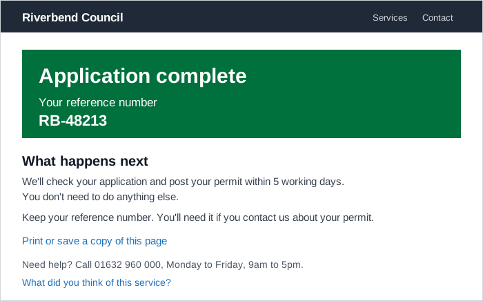 The green panel answers “did it work?” at a glance, and everything below it answers “what now?”: when the permit arrives, that nothing else is needed, and how to keep a record.
Background
A confirmation page is the page a service shows once a transaction is finished, at the end of a Process Funnel, such as an application sent, an appointment booked, or an order placed. It’s different from a confirmation dialog, which asks people to confirm before a consequential action happens (see Error Prevention and Recovery). The confirmation page is the last thing people see of a task, and by the peak-end rule it carries much of how the whole task is remembered. It also outlasts the session: people screenshot, print, and bookmark it as a receipt, the kind of tangible evidence Service Design uses to show that an intangible service actually happened, so it has to make sense later on its own, without the steps that led to it.
The confirmation page is the last thing people see of a task, and by the peak-end rule it carries much of how the whole task is remembered.
Problem
A transaction that ends on a bare “Success” message, or drops people back on the homepage, leaves them unsure whether it worked, what happens next, and whether they still need to do anything. Some will phone a helpline to check, and some will submit the same thing again. Mistakes in what they entered, noticed only after submitting, are now much harder to fix.
Solution
Let people check their answers before they submit
Show a single check-answers page immediately before submission for small and medium-sized transactions. For a very large transaction with several sections, a check-answers page at the end of each section can help, particularly where different people complete different sections. Seeing every answer in one place gives people confidence that they’ve finished and that their information was captured, and gives them a second chance to catch errors while they’re still cheap to fix. As the last step of a long form, it’s also one of the main supports for people with memory and attention differences (see Cognitive Accessibility).
- Say what the page is for. Use the page title to tell people what to do, such as “Check your answers before sending your application,” and make clear the transaction isn’t complete until they confirm. Otherwise they can miss the submit button at the bottom.
- Show only what’s relevant. Break the answers into sections, leave out sections for questions the person was never asked, and rewrite long questions as short statements.
- Name the action on the submit button, such as “Send your claim form” rather than a generic “Submit” (see Call to Action).
- Mark skipped optional questions as “Not provided” so people can see they left them blank rather than wondering whether the answer was lost.
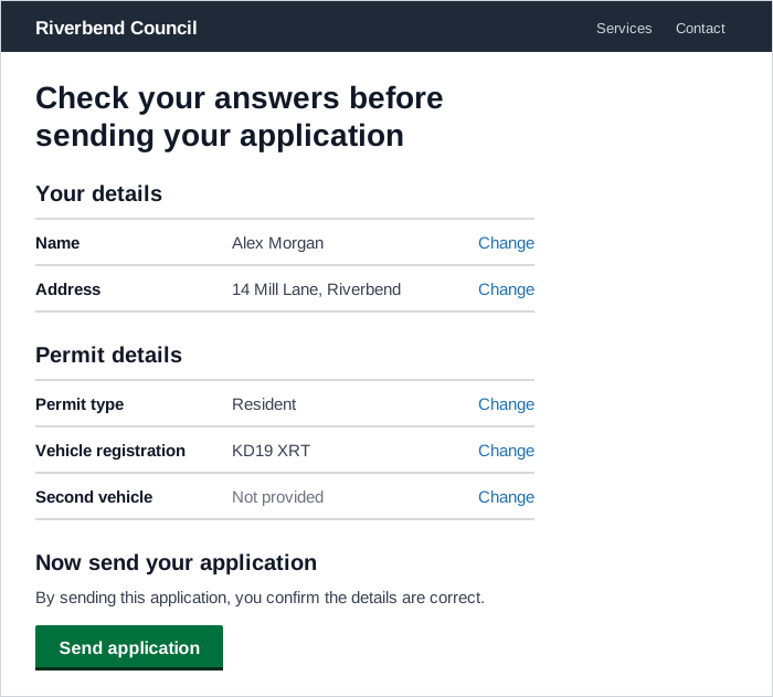 Shown just before submission, this is the last point where a mistake is still cheap to fix, which is why every row carries its own Change link.
Give every answer a “Change” link. Following it should take people to that answer, pre-filled the way they left it, and continuing from there should bring them straight back to the check-answers page rather than through the rest of the transaction again. If the change means new questions need asking, ask them before returning. Each link needs visually hidden text saying what it changes, so a screen reader user hears “Change name,” not a list of identical “Change” links:
<a href="/name">Change<span class="visually-hidden"> name</span></a>A two-thirds-width layout suits short answers: it keeps lines readable and the Change links close to the answers they belong to, so people using screen magnifiers are less likely to miss them. Longer answers may need the full width. For an online order, Quick-Flow Checkout’s Recap before submission covers the same step with the details specific to items, shipping, and charges.
Confirm the outcome in one prominent heading
Open the page with a highly visible panel whose heading says what the person has just done, such as “Application complete” or “Booking complete,” with any reference number inside the panel. Keep the panel’s text brief. It’s a high-level statement of what happened, and the detail belongs below it. In the NHS’s research, people found a green panel at the top of the page reassuring and understood its message quickly, and people with color blindness could still read it and recognized it as a confirmation. Reserve this panel for confirmation (and interruption) pages so it keeps its meaning. Keep links and buttons out of it too, because interactive elements on the colored background won’t meet contrast requirements unless the panel’s or focus state’s styling is changed.
Describe only what has actually happened. Where a submission still has to pass through several systems before it’s received, say so, for example “Form submission started on [date],” rather than claiming the application is complete.
Where a submission still has to pass through several systems before it’s received, say so
Explain what happens next, and when
The panel tells people the transaction worked. The rest of the page should answer the questions that come straight after:
- what happens next, and when they should expect to hear something
- whether they need to do anything while they wait, including any further forms, with clear guidance for each
- what to do, and who to contact, if they have a question or a problem
When there’s nothing more for someone to do, say so plainly. People in NHS testing wanted that reassurance before their appointment, and the absence of an instruction doesn’t provide it. Where the next steps play out over weeks, a step-by-step process list shows people where they are. For the longer-term status of an order, see Order Tracking and History.
Explain the reference number
If the transaction produces a reference or confirmation number, show it, and tell people what it is, why they’d need it, and whether to keep it. Only show a number people actually need to keep. An unexplained string of characters adds noise to the page.
Give people a record they can keep
People treat a confirmation page as a receipt. Some screenshot it, many want to print it or download their submission, and some bookmark it to come back to. Give them a way to keep a record:
- A printable page. A “Print this page” button and print styling that drops navigation such as breadcrumbs and uses the full print width (see Printable Pages).
- A copy of what they submitted, in the page itself as HTML as well as any PDF download, since an HTML copy is easier to use with assistive technology than a PDF alone. Mask sensitive identifiers, such as government ID numbers, in that copy.
- A download, with its time limit stated if the file is only available for a fixed period.
Make a bookmarked confirmation page still work
Let people return to the confirmation page through a bookmark wherever possible. If that can’t be done, respond helpfully when they come back: link to tracking the application, starting a new one, and who to contact about a problem, rather than showing an error. In the same spirit, only offer a status-tracking link when that tool can actually find this submission. A form sent by someone who isn’t signed in may not show up in their account’s status tool straight away, so a link there leads to an empty page.
Keep the page focused
A confirmation page can include links to information or services people are likely to need next, a link to give feedback on the service, and a secondary link back to the main site. But each addition has a cost: in NHS research, people became confused about their next step when a confirmation page held several different components, especially people using screen readers.
in NHS research, people became confused about their next step when a confirmation page held several different components, especially people using screen readers
If the transaction is one step in a larger task, the next step may matter more than this step’s completion, and it can become the page’s one Call to Action. Offers that benefit the business more than the person, such as account creation or related products, belong after the confirmation itself and should be easy to decline (see Sign-In and Account Creation and Cross-Selling and Up-Selling).
Related Concepts
Patterns
- Quick-Flow Checkout
- Process Funnel
- Call to Action
- Form Design
- Printable Pages
- Order Tracking and History
- Sign-In and Account Creation
- Cross-Selling and Up-Selling
- Multiple Destinations
Principles
Processes
Sources
GOV.UK Design System is the source for the check-answers guidance (page title, sections, Change links with hidden text, returning to the check page, “Not provided,” layout), the required contents of a confirmation page, the confirmation panel’s purpose and contrast caveat, and handling bookmarked confirmation pages.
Confirmation Page (NHS Digital Service Manual) supplies the research on the green confirmation panel, explaining reference numbers, saying when nothing more needs doing, and keeping the page from holding too many components.
Form Confirmation and Keep a Record of Submitted Information (VA.gov Design System) is the source for describing only what has actually happened (“Form submission started”), the questions next-step content should answer, the printable record with an HTML copy and masked identifiers, stating download time limits, and not linking unauthenticated submissions to status tools.