
Cards
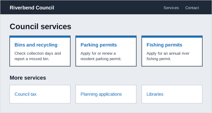 Each card is a short, self-contained summary whose heading links to the detail, and the plainer second row shows less important services taking less visual weight.
Background
A card is a bordered or shaded container that groups a heading, a short summary, and a way to act on it, sometimes with an image, into one self-contained unit. Cards almost always appear as a collection that people scan to find the item they want and decide where to go next. That modularity is the point: each card stands on its own and summarizes something more detailed elsewhere. It’s also why cards are overused. A box with a border is an easy default for almost any content, but content that isn’t a summary, or that only makes sense read in sequence, gains nothing from the frame except visual noise.
each card stands on its own and summarizes something more detailed elsewhere
Problem
Cards get used as a general-purpose container: to highlight a paragraph inside long-form content, to stand in for the rows of a table, to frame a single button, or simply to decorate. In a collection where every card repeats the same image or boilerplate text, the cards are hard to tell apart. Long text in narrow cards becomes hard to read on small screens. And a card wrapped entirely in a link makes a screen reader announce all of its content as one long link.
Solution
Use cards for collections of related, self-contained summaries
Cards suit a set of related items of the same kind, such as articles, sections of a site, services, or appointments, where each card summarizes something people can open for more detail. Keep cards in a collection uniform in look and structure so people can compare them at a glance. The NHS found in testing that cards helped people scan for relevant information and decide where to go next. A card can also frame a specific decision or Call to Action a person needs to take, such as continuing an application or confirming an appointment.
Choose something else when the content isn’t a card
Many things that could be drawn in a box are better served by another component:
- Highlighting content within a long page: use inset text, an expandable details section, or a warning callout instead.
- Tabular or large data sets: a collection of cards doesn’t scale to many items or support comparing values side by side. Use a table instead.
- A single action: use a button (see Call to Action).
- Text meant to be read in order: if people are meant to read from one card to the next, use a list, or body text with headings.
- A section of a form: group related fields in a fieldset, and don’t style it to look like a card (see Form Design).
- Content added in response to something the user did: use an alert or other notification.
- Search results: use caution. A card around every result can add noise. With little data per result, drop the container and show plain rows. With a lot, add pagination, search, and filters instead (see Organized Search Results).
And don’t use a card purely as decoration, for any content that just happens to need a border around it.
Keep each card short and distinct
People should be able to take in the most important information on a card at a glance, with the detail one link away. Write a short, specific heading that says what the card contains, and keep the summary to a line or two (see Headlines and Blurbs). If the card links to a page, make the link text match that page’s heading. Don’t repeat content or images shared by every card in the collection, because repetition makes the cards harder to tell apart. And avoid inserting dynamic values into the middle of a sentence, which makes the text hard to translate (see Internationalization).
Don’t repeat content or images shared by every card in the collection, because repetition makes the cards harder to tell apart.
Make every card lead somewhere, without wrapping the whole card in a link
Since a card summarizes something more detailed, it should give people a way to act on it or read more. How much of the card should respond to a click is where sources disagree:
- NHS offers “clickable” card variants where the whole card responds, but warns against wrapping the entire card in a link, which is a difficult experience for screen reader users.
- VA.gov says a card is not a button or a link and shouldn’t be used as a large tap target. The link inside it does that job.
- Fitts's Law argues for the opposite on a summary card: if the whole card looks like one unit but only a small “View” button inside it works, people have to aim for a far smaller target than the card’s visual size suggests.
All three agree on the markup: a real link inside the card, usually on the heading, rather than an <a> element wrapped around everything. Whether that link’s clickable area then extends to fill the card is a styling choice, and the Fitts’s Law argument favors extending it when the card has a single destination. When a card holds more than one link or action, keep it non-clickable, so each link works on its own. Either way, pressing Tab should move focus to the link or action inside the card.
Limit card actions to three, labeled against the card’s heading
Some cards carry actions, such as edit appointment, cancel order, or approve application. Keep them to three at most, and don’t put actions on a card that is clickable as a whole. Screen readers announce a card action together with the card’s heading, so if the heading already says “Appointment on 3 March,” the action links can be just “Edit” and “Delete.” Within a collection, use the same link style for the same kind of action on every card, and keep the most prominent action style for a card that holds the page’s main call to action. If an action is hard to undo, add a warning or a confirmation step (see Error Prevention and Recovery).
Use emphasis variants to show priority within a group
Not every card in a group is equally important. A primary card with a border or stronger styling draws more attention than a secondary card with a lighter or shaded background, which suits less important content or actions alongside it. A drop shadow can single out one card at the top of a page or section, and an icon can tell card types apart, such as in-person and video appointments (see Visual Hierarchy). Keep the styling simple. Folds, curled corners, or paper textures that play up the physical-card metaphor distract from the content. A plain shadow is enough to suggest the card sits above the page (see Affordance for elevation as a signifier).
Add images only when they help
Only add images to cards when there’s evidence they help people, for example where they motivate people to act, rather than by default (see Effective Images). An image in a card is usually decorative, because the heading and text already say what the card is about, so give it empty alt text (see Alt Text). Choose images that still work as the card changes size across devices, and don’t reuse the same image across a collection.
Mark up a card group as a list
Mark up a group of cards as an unordered list, with each card as a list item, so screen readers announce how many cards there are and let people move between them. Set each card’s heading level to fit the page’s heading outline rather than leaving a component’s default level in place. Keep the heading before any image in the source order, even if the image displays above it.
<ul class="card-group">
  <li class="card">
    <h3><a href="/parking-permits">Parking permits</a></h3>
    <p>Apply for or renew a resident parking permit.</p>
  </li>
</ul>
The <h3> here assumes the cards sit under an <h2> section heading. A card group sitting directly under the page title would use <h2>.
Size cards to the layout grid
Set card widths from the page’s layout grid, such as halves, thirds, or quarters of the content area, so cards in a row share the same edges and gutters, and stretch cards in a row to the same height. When cards are a third or a quarter wide, check them on small screens, where they become narrow and any paragraph of text becomes hard to read. For a dashboard built from standard card types (status, trend, details), see Dashboard Design’s Build content as a set of standard cards.
Related Concepts
Patterns
- Grid Layout
- Dashboard Design
- Call to Action
- Data Tables
- Organized Search Results
- Notifications
- Form Design
- Headlines and Blurbs
- Internationalization
- Alt Text
- Effective Images
- Carousels
Principles
Sources
Card (NHS Digital Service Manual) is the source for when not to use a card, primary and secondary cards, clickable cards and the warning against wrapping a card in a link, the three-action limit and heading-based action labels, images only with evidence, card widths on the grid, and the research on cards helping people scan.
Card (U.S. Web Design System) supplies the collections-of-related-content use, the alternatives for tabular data, single actions, and sequential text, making every card actionable, non-repeated content and images, simple non-skeuomorphic styling, and the list markup and source-order guidance.
Card (VA.gov Design System) is the source for uniform collections and cards that frame a decision, the alternatives for form sections, dynamic content, and search results, the case against cards as large tap targets, consistent link styles and the three-call-to-action limit, the drop-shadow and icon variants, and translation-proof card text.