
Carousels
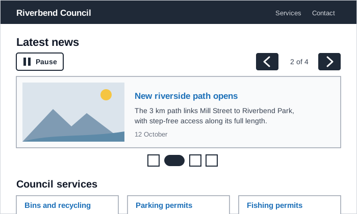 A news carousel with its pause button placed before the slides, labeled previous and next buttons, a “2 of 4” position, and a slide picker that marks the current slide by shape as well as color, with the next section of the page still in view below it.
Background
A carousel, also called a slideshow or slider, shows a set of items one or a few at a time in the same space, with controls to move between them. Some rotate to the next item automatically. Carousels are common on homepages, for featured stories, news headlines, and image galleries, because they seem to fit several items into one prominent spot. In practice, most people see only the first item, and the movement creates accessibility requirements a static layout doesn’t have. Government design systems that offer one at all treat it as a component that only works when it’s carefully built.
most people see only the first item
Problem
Content after the first slide is hidden until someone moves the carousel, and most people don’t. When the University of Notre Dame tracked its homepage carousels, most visitors didn’t interact with them, and those who did mostly chose the first item. A carousel can also hide the rest of the page. In testing of the beta GOV.UK homepage, people didn’t notice the browse sections below the carousel and didn’t scroll down to them.
Automatic rotation moves content on before people finish reading it and distracts people with attention difficulties. It can also move a screen reader user onto a new slide without warning. Carousels that change slides only by swiping exclude people who can’t swipe. And every extra control means more Tab presses for keyboard users and more scrolling for people using screen magnification.
Solution
Consider whether a carousel is needed at all
A carousel suits a set of similar items that people browse for interest, such as news stories or photos, where missing most of them costs little. Don’t put information people need in a carousel, since anything after the first slide may never be seen. Often a static alternative works better:
- show the single most important item on its own;
- lay the items out as a group of Cards that people can scan all at once;
- for a homepage, give the main sections fixed, visible space (see Homepage Portal).
The Scottish Government Design System leaves carousels out entirely, as most government design systems do, and points people to its navigational page patterns instead.
Put the most important item first, and keep the rest of the page in view
If you do use a carousel, put the most important item in the first slide, because it’s the one most people will see. Give the carousel a heading that says what the set is, such as “Latest news.” Keep the carousel short enough that the start of the next section shows below it. GOV.UK responded to its homepage testing by making the sections below its carousel more prominent (see Above the Fold). A carousel is a weak place for a page’s main Call to Action, since it’s only visible while its slide is showing.
Don’t rotate automatically, or let people stop it
Content that moves by itself for more than five seconds alongside other content needs a way to pause, stop, or hide it, under WCAG’s Pause, Stop, Hide success criterion (see Accessibility). The simplest fix is a carousel that changes slides only when someone uses its controls. If a carousel does rotate automatically:
- Put a stop button first among the carousel’s controls, before the slides, so people find it before the content moves on. Change its label to match what it will do (“Stop slide rotation,” then “Start slide rotation”).
- Stop rotation while the mouse is over the carousel.
- Stop rotation when keyboard focus moves into the carousel, and don’t restart it until the person asks. Otherwise a screen reader user moving through a slide can land on the next slide’s content with no sign that anything changed.
a carousel that changes slides only when someone uses its controls
Provide visible controls for moving between slides
Give every carousel previous and next buttons, made with real <button> elements. Pressing one shouldn’t move keyboard focus, so people can press it repeatedly. Keep the buttons on small screens too, rather than relying on swipe gestures, which not everyone can use, and make them large enough to hit easily (see Fitts's Law).
If you add a slide picker, the row of dots for jumping to a specific slide, mark the current slide by shape as well as color, and in text for screen readers. Every control adds a Tab stop, and controlling a carousel already costs keyboard users extra presses. A picker built as a set of tabs adds a single Tab stop. A separate button for each slide adds one per slide, which makes it the hardest version for keyboard users. Where text sits on top of an image, keep its contrast high (see Effective Images).
Structure and label the carousel for assistive technology
Wrap the carousel in a region labeled by its visible heading, and give each slide a label, such as “3 of 4” when slides have no unique titles. aria-roledescription lets a screen reader announce the region as a carousel and each item as a slide, instead of a generic region and group. Use it only on container roles like these, and translate its value when the page is localized, since it replaces the role name a screen reader would otherwise announce in the user’s own language. Hide slides that aren’t showing from assistive technology properly, rather than only moving them off-screen, and mark up each slide’s content with real headings, links, and alt text (see Alt Text).
<section aria-roledescription="carousel" aria-labelledby="news-heading">
  <h2 id="news-heading">Latest news</h2>
  <button type="button">Stop slide rotation</button>
  <div aria-live="off">
    <div role="group" aria-roledescription="slide" aria-label="2 of 4">…</div>
  </div>
</section>
The live region wrapping the slides is off while the carousel rotates by itself, so screen readers don’t announce every automatic change, and polite when slides change only in response to the controls (see WAI-ARIA (Accessible Rich Internet Applications)).
Tell people when the slide changes, without moving them
When someone presses previous or next, announce the new slide, such as “2 of 4,” through a polite live region. Screen reader users then know the content changed, without being interrupted or having focus moved. When the carousel advances on its own, don’t move focus or pull people away from where they are on the page. A slide change that isn’t announced is easy to miss for anyone not looking straight at it (see Change Blindness).
Related Concepts
Patterns
Principles
- Accessibility
- Motion Design
- Cognitive Accessibility
- Change Blindness
- Fitts's Law
- Interface Design Principles
Standards
Further reading
The W3C WAI’s Carousels Tutorial (W3C Document License, which doesn’t permit derivative works) is the most detailed implementation guide, from labeled list markup and non-focus-moving previous/next buttons to a visually hidden “Item x of y” announcement. Unlike the WAI-ARIA Authoring Practices pattern this page follows, it resumes rotation once mouse or keyboard focus leaves the carousel.
W3C’s Understanding Success Criterion 2.2.2: Pause, Stop, Hide (W3C Document License) explains the five-second rule, why it applies to the whole page, and whether paused content should resume where it stopped or jump to its current state.
Erik Runyon’s Carousel Interaction Stats (© Erik Runyon, no stated open license) is the original Notre Dame tracking data: about 1% of homepage visitors clicked a carousel item, 84% of those on the first position. He suggests limiting a carousel to three or four items.
The NSW Digital Design System’s card carousel (© NSW Government, no stated open license on the design system site) is a government component built to the WAI-ARIA carousel pattern, meant for four to nine related cards of the same type, once per page. It’s not for important information, and it should link to the full collection.
The Victorian Government’s Ripple design system carousel (© State Government of Victoria, no stated open license) allows three to nine related promotion cards with pagination controls, with an accompanying title, and not mixed with navigation or other card types.
Sources
Carousel (Scottish Government Design System) is the source for carousels being left out of most government design systems, the Notre Dame finding that most people ignore items after the first, the static alternatives, the need for keyboard use, pausing, and announced updates, and the extra scrolling and Tab presses carousels cost people using magnification or a keyboard.
Iterate. Then iterate again. (Government Digital Service blog) supplies the GOV.UK homepage testing, where people didn’t notice or scroll to the sections below the carousel, and the response of making those sections more prominent.
Carousel Pattern (W3C WAI-ARIA Authoring Practices Guide) is the source for the stop button’s place first among the controls and its changing label, stopping rotation on hover and on keyboard focus until the user restarts it, the disorienting effect of unannounced rotation, previous and next buttons that don’t move focus, the tabbed and per-slide-button pickers, slide names like “3 of 4,” properly hidden slides, and the off/polite live region setting.
ARIA: aria-roledescription and aria-live attributes (MDN Web Docs) is the source for using aria-roledescription to name the carousel and slide containers, its limits and localization, the polite live region that announces slide changes without moving focus, and the off setting for content that changes by itself.